This article was co-authored by wikiHow staff writer, Nicole Levine, MFA. Nicole Levine is a Technology Writer and Editor for wikiHow. She has more than 20 years of experience creating technical documentation and leading support teams at major web hosting and software companies. Nicole also holds an MFA in Creative Writing from Portland State University and teaches composition, fiction-writing, and zine-making at various institutions.
There are 8 references cited in this article, which can be found at the bottom of the page.
The wikiHow Tech Team also followed the article's instructions and verified that they work.
This article has been viewed 9,667 times.
Learn more...
Want to make a truly authentic 90s-style website? While most modern designers cringe at 90s web design choices, you can't deny that websites were more fun back then! Even if you don't know how to code a website by hand like most did in the 90s, you can still get that retro web aesthetic using drag-and-drop website builders, templates, and blog themes. This wikiHow article will list all the features you should add to your website to make it authentically 90s, plus where to find the best free 90s graphics like backgrounds, buttons, templates, animated GIFs, and more!
Things You Should Know
- 90s-style websites are known for busy backgrounds, bright colors, and animated GIFs and buttons.
- Sticking to the original 216-color "web-safe" palette will ensure your website looks authentic.
- You'll usually need a little bit of HTML knowledge to give your website that 90s retro aesthetic.
Steps
Get inspired.
-
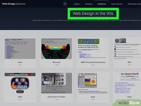
If you're looking for examples of 90s-style web design, you're in luck. Now that retro web design is having a comeback, it's easy to find archives of real web 1.0 sites, as well as modern takes on 90s web aesthetics.
- Web Design Museum: This web gallery geared toward "forgotten trends in web design" is loaded with screenshots from websites dating as far back as 1991.[1] X Research source
- Neocities: This free webhosting site is home to tons of 90s-style websites (and some modern ones) thanks to the service's similarity to 90s website megahost Geocities. You'll find tons of active retro websites with all of the best (worst?) features of the 90s, including plenty of colorful Comic Sans text and low-resolution animated GIFs.
- The Geocities-izer: Speaking of Geocities, this fun tool will display any website as it would have looked if it were on Geocities in the 90s. Try it out with wikiHow.com—just turn down your speakers first!
- Cameron's World: This site takes the wildest 90s website traits and combines them into a single webpage.
- Wayback Machine: If you want to see old 90s websites that no longer exist or just see old versions of current websites, you'll love Archive.org's Wayback Machine.
Find the right web host.
-
If you haven't chosen a home for your 90s website, you'll want to do that first. Whether you want to pay for a web host or try a free webhost, your options are endless! Just make sure you choose a host that lets you customize your theme or edit HTML directly, depending on your skill level.
- While WordPress is the modern go-to option for free blogs, it won't be easy to make a WordPress blog look like the 90s unless you use a 90s-inspired WordPress theme. Most modern website builders focus on responsive design, which didn't exist in the 90s. If you want to create an authentic 90s-looking blog, you'll need a customizable host that lets you edit HTML directly like Blogger or Tumblr—both have tons of 90s-inspired themes to play around with.
- If you're looking for host with the 90s spirit and you're willing to write (or copy and paste) HTML code from scratch, Neocities has a free tier that boasts enough features to cover all of your 90s website needs. And if you're new to HTML or a little rusty, you can design your layout in a generator like Sadgrl's Layout Builder and paste the code into your own site!
- If your host supports Bootstrap, try the Geo for Bootstrap website template, which is loaded with Comic Sans fonts, rainbow colors, beveled buttons, fake progress bars, and more.
Use 90s fonts and font effects.
-
Today's simplistic sans-serif fonts won't get you that retro aesthetic. Instead, opt for old school fonts like Comic Sans for all of your text. If you can't bring yourself to go all in on Comic Sans, stick to a serif font like Times New Roman. And the more colors you use, the better!
Only use colors from the web-safe color palette.
-
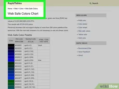
While today's devices can display millions of colors, older computers could only show 256 colors at a time. And because only 216 of those colors displayed exactly the same on both PC and Macs, 90s web developers relied on a palette of only 216 "web-safe" colors to ensure that their sites looked exactly the same on all platforms.[3] X Research source While the web-safe palette is no longer needed, sticking to the colors from this palette for text, images, and HTML elements will give you that true 90s aesthetic.
- Search the web for "web-safe color palette" to find the hex codes and color names, or just check out this site: https://www.rapidtables.com/web/color/Web_Safe.html.
- You can use these color hex codes for fonts, tables, and more.
Choose a busy tiled background image.
-
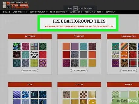
In the 90s, having a repeating pattern background image was all the rage. Any image that repeats seamlessly will work as a background—think starry skies, rainbow clouds, bricks, cement, colorful fractals, wood grain, and Lisa Frank-style animal prints.
- Search the web for "free repeating background" and see what comes up. You can also check out Background Tiles or Pixabay's repeating gallery for backgrounds that tile seamlessly.
- Check out Textures Town for 3D animated background textures in the GIF format.
- If you don't want to go overboard with a busy background, you can still get the aesthetic with a solid black background. Just make sure you use lots of brightly-colored text and images.
Create text graphics with retro effects.
-
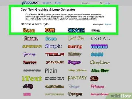
Use a text graphics to create colorful stylized text-based graphics. 90s websites were loaded with flashy text logos made from ornate or futuristic fonts. You'll need at least one text-based graphic to welcome visitors to your site!
- Cool Text's graphics and logo generator lets you crate free text logos from an assortment of true-to-the-90s styles.
- Flaming Text has more great free 90s logo creation templates, plus a few modern ones.
- Make Wordart lets you design 90s-style Microsoft Word WordArt logos right in your browser.
Load your website with animated buttons and GIFs.
-
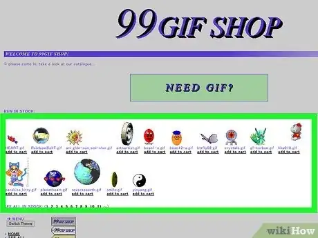
The animated GIFs of the 90s were not as high-quality as those you'll find today. Fortunately, there are plenty of retro GIF websites and search engines that let you download all those flashy pixelated backgrounds you won't find on social media. Save the ones you love or loathe most for your website.
- One of the best places to find authentic 90s GIFs is the Internet Archive's GeoCities Animated GIF Search Engine. Try searching for "button" to find all sorts of directional buttons (like "Next" and "Back"), or "cat" to find all sorts of silly cat-related GIFs.
- Check out 99GIF Shop for lots of free GIFs straight out of Web 1.0!
- You can create your own pixel art animations with a free online editor like Piskel.
- Check out Glitter Graphics for all things glitter, including animated glittering backgrounds, dividers, icons, banners, and buttons for your website.
- Visit the 88x31 GIF Collection to find hundreds of buttons that are 88x31px—the most common size for website buttons in the 90s.
- You can find a massive amount of free badges for all sorts of tools and topics at Web Badges World or, make your own blinking buttons at Blinkies Café.
Place a web hit counter somewhere on your page.
-
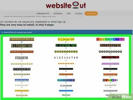
While most of today's websites track visitors in the background, 90s websites boldly displayed hit counters right on the page. Fortunately, you can still add an authentic-looking visitor counter to your website thanks to sites like Free Website Hit Counter and Free Web Counter. Just select the most absurd counter on the page, add your URL to the field, and click Generate free hit counter HTML code to get the code you'll need to add to your website.
Make sure your website stays "Under Construction."
-
It's not a 90s website without one or more "Under Construction" graphics. Even though it's tough to find these relics on the web now, one archivist from the Archive Team collected every "Under Construction" graphic and added them to a single webpage.[4] X Research source They're free to download—grab some!
Use HTML tables to lay out your website.
-
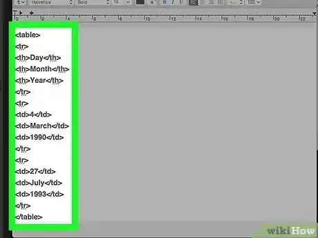
Before there was CSS, web designers used clunky tables to lay out their websites. Fortunately (unfortunately?), tables are not obsolete—you can still use HTML tables to create realistically-90s website layouts if you're comfortable enough with HTML to get your hands dirty in code.[5] X Research source
- HTML tables of the 90s often had thick beveled borders, often with too much (or too little) padding between the text and objects on the page and those borders.
- If you'd rather not mess around with tables, you can get the same effects applying CSS properties to Div tags—especially the border-style: inset property.
Play a MIDI sound file in the background.
-
Embed a low-fi song in the background to really immerse your visitors. So many websites in the 90s were set to music—you can still use the HTML5
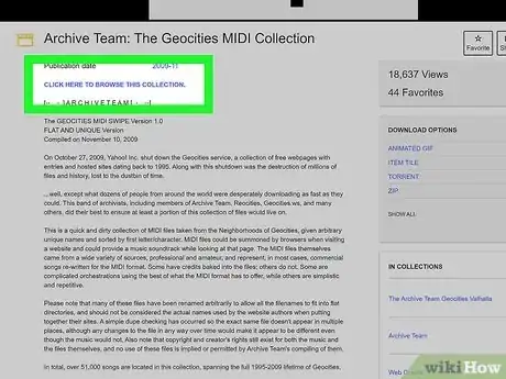
<audio>tag to automatically play music once a visitor loads your page.[6] X Research source Check out the Geocities MIDI Collection from the Internet Archive for an authentic selection of retro song files.
Go overboard with JavaScript animations.
-
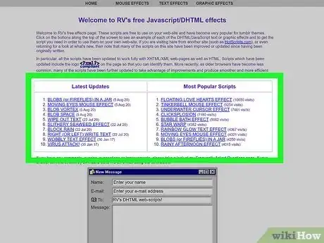
Have you ever moved your mouse on a 90s website and noticed a silly cursor animation? Or maybe shooting stars or raindrops darting across the text? Web designers used simple JavaScript code to add all sorts of moving images and effects to websites, such as changing the mouse cursor to hearts, stars, or smiley-faces.[7] X Research source As long as you can edit your website's HTML code directly, you can easily copy JavaScript code that brings these 90s effects straight to your page.
- 90s Cursor Effects has 9 simple cursor effects, including rainbows and snowflakes.
- RV's Free JavaScript/DHTML Effects has tons of free mouse, text, and graphics effects that are easy to add to any website.
- Web Neko features animated Neko the Cat mouse cursors that chase the mouse as it moves.
Add a lengthy links page or section.
-
Every 90s website proudly displayed links to other great sites on the web. Whether you want to add your links right to your main page or create a page dedicated to your favorite websites, be sure to fill up your links section with other 90s-inspired websites (and wikiHow.com, of course).
Tell visitors to sign your guest book.
-
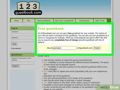
Before there were blog comments, people left comments on virtual guest books. The 90s guestbook providers may no longer exist, but you'll still find easy-to-add guestbooks you can link to prominently on your 90s-inspired website, including 123 Guestbook and Smart GB.
Warnings
- When you find graphics, backgrounds, and buttons online, be sure to download them from the site and upload them to your own web host before using them in your designs. Hotlinking images (when a website uses an image that's on another person's webserver) is frowned-upon, as it uses up the artist or archive's bandwidth.[8] X Research source⧼thumbs_response⧽
- Using blinking or flashing images on your website looks cool, but it could negatively affect viewers with seizure disorders. Use these features sparingly, or add a big warning to the top of your page so people can choose to click away.⧼thumbs_response⧽
You Might Also Like
 How to Change Text Color in HTML and CSS


 How to Design a Website: Ideas, Layout, Optimization, & More





References
- ↑ https://www.webdesignmuseum.org/
- ↑ https://developer.mozilla.org/en-US/docs/Web/HTML/Element/blink
- ↑ https://www.techopedia.com/definition/24359/browser-safe-palette
- ↑ http://textfiles.com/underconstruction/
- ↑ https://www.w3.org/WAI/PF/HTML/wiki/Table/layout_TABLE_deprecation
- ↑ https://html.com/media/
- ↑ https://github.com/tholman/cursor-effects
- ↑ https://www.pixsy.com/academy/image-owner/hotlinking/
About This Article

