This article was co-authored by wikiHow staff writer, Jack Lloyd. Jack Lloyd is a Technology Writer and Editor for wikiHow. He has over two years of experience writing and editing technology-related articles. He is technology enthusiast and an English teacher.
The wikiHow Tech Team also followed the article's instructions and verified that they work.
This article has been viewed 365,036 times.
Learn more...
This wikiHow teaches you how to place labels on the vertical and horizontal axes of a graph in Microsoft Excel. You can do this on both Windows and Mac.
Steps
-
1Open your Excel document. Double-click an Excel document that contains a graph.
- If you haven't yet created the document, open Excel and click Blank workbook, then create your graph before continuing.
-
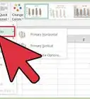
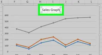
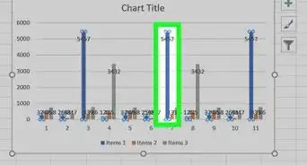
2Select the graph. Click your graph to select it.Advertisement
-
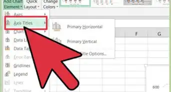
3Click +. It's to the right of the top-right corner of the graph. This will open a drop-down menu.
-
4Click the Axis Titles checkbox. It's near the top of the drop-down menu. Doing so checks the Axis Titles box and places text boxes next to the vertical axis and below the horizontal axis.
- If there is already a check in the Axis Titles box, uncheck and then re-check the box to force the axes' text boxes to appear.
-
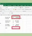
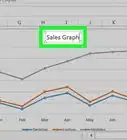
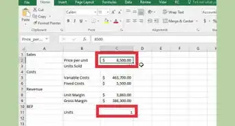
5Select an "Axis Title" box. Click either of the "Axis Title" boxes to place your mouse cursor in it.
-
6Enter a title for the axis. Select the "Axis Title" text, type in a new label for the axis, and then click the graph. This will save your title.
- You can repeat this process for the other axis title.


Community Q&A
-
QuestionHow do I put words of axes labels on two or three lines?
 Community AnswerYou need to use macros for this. Go to Settings and add the Developer tab. Then enable the file as macro-enabled. This will allow you to right-click onto edit mode; from here you can add words on any amount of lines you need.
Warnings
- If you switch your chart type to a type that does not support axis labels such as a pie chart, your axis labels will disappear. However, your axis labels will reappear if you switch back to the original chart type.⧼thumbs_response⧽

About This Article
1. Open an Excel document.
2. Click the graph.
3. Click +
4. Click Axis Titles
5. Click an "Axis Title" text box.
6. Type in the label you'd like the axis to have.