wikiHow is a “wiki,” similar to Wikipedia, which means that many of our articles are co-written by multiple authors. To create this article, volunteer authors worked to edit and improve it over time.
This article has been viewed 205,803 times.
Learn more...
Microsoft Excel is more than a simple spreadsheet application; it also allow users to create complex calculations and organize data efficiently through the use of pivot tables, functions and graphs. A graph, also referred to as a chart in Excel, allows users to communicate not only data, but also the deeper meanings and implications that data can suggest. Graphical data is much easier for personnel outside of an accounting department to understand. Here's how to add titles to graphs in Excel in order to present the most accurate and complete depiction of a scenario.
Steps
-
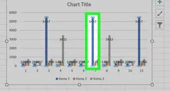
1Click on the chart that needs a graph title in order to select it. A currently selected graph will have a shaded outline.
-
2Notice several additions to the main toolbar when the graph is selected: Design, Layout and Format. These options are under a new header entitled "Chart Tools."Advertisement
-
3Select the Layout tab in the main toolbar. The Labels section of this tab holds the commands for working with titles and labels.
-
4Choose "Chart Title."
- "Centered overlay title" will place a tiled object containing a generic title on the graph that will not resize it.
- "Above chart" will resize the chart and make room for a centered generic title above the graphical image.
-
5Move your mouse and click inside the generic chart title to change the name of the chart to something more descriptive.
-
6Click "Chart title" on the toolbar again and select "More title options" at the bottom of the drop-down menu.
- Here you can add other elements such as a border, fill color or 3-D format to your title.
- You can also add additional rules to the alignment of your title to manipulate the vertical alignment, text direction and custom angle.
-
7Change the font and character spacing of your graph title by right-clicking on the title.
- You can change the font style, size and color of your title.
- You can also add many different effects like strike-through, subscript, superscript and small caps.
-
8Click Axis Titles to add these elements to your chart in Excel.
- The Primary Horizontal Axis Title option places that title below the horizontal axis.
- The Primary Vertical Axis Title menu includes several options for the display of the vertical axis title.