wikiHow is a “wiki,” similar to Wikipedia, which means that many of our articles are co-written by multiple authors. To create this article, 10 people, some anonymous, worked to edit and improve it over time.
This article has been viewed 220,257 times.
Learn more...
Charts are used to provide a graphical representation of a concept or point. Pivot charts created in Microsoft Excel can be more useful than ordinary charts, because they are more easily manipulated to show different information and summarizations. Learning to create a pivot chart can be confusing and there are a few decisions you need to make before you begin. Here's how to create a chart from a pivot table, step by step, so you can take advantage of this useful tool.
Steps
-
1Launch the Microsoft Excel application.
-
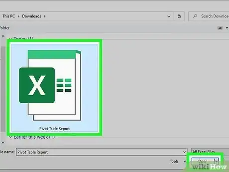
2Browse to, and open, the file containing the pivot table and source data from which you want to create a chart.Advertisement
-
3Decide on the statement you want your pivot chart to represent.
- This decision will determine how you craft your pivot chart.
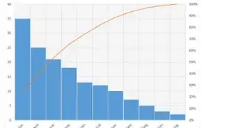
- The style of the chart and the columns that are used will depend on this one statement of conclusion. For instance, a bar chart is useful for representing the data under differing conditions, such as sales per region, while a pie chart can be used to display percentages or portions of a whole.
-
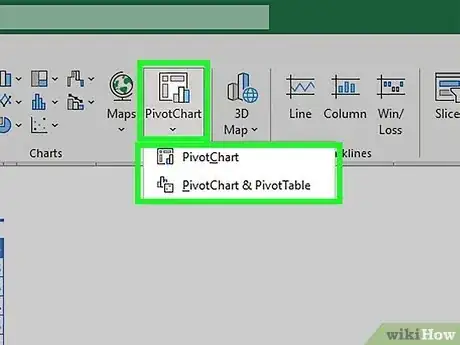
4Locate and launch the Pivot Chart wizard.
- In Excel 2003, this will be under the "Data" menu.
- In Excel 2007 and 2010, you will find this on the "Insert" tab.
-
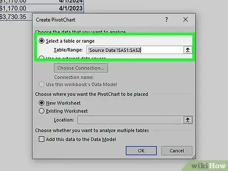
5Set the range for your pivot chart. It should be the same range used for the related pivot table.
-
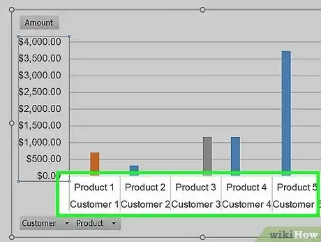
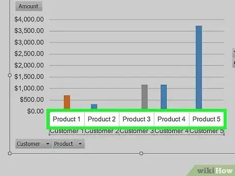
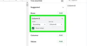
6Drag one column label representing the "x" axis of the chart and drop it into the "Axis Field" section of the Pivot Table Field List.
-
7Choose the column label containing the data you want to display by the "x" axis field and drag it into the "Values" section of the Pivot Table Field List.
- For instance, if your source data is a spreadsheet of sales by product and customer name, you may choose to drop either the customer name or the product column label into the "Axis Field" section. You would drag the column label for the sales amounts into the "Values" section.
-
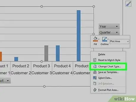
8Alter the chart type by right-clicking on the chart background area and choosing "Change Chart Type" from the pop up menu.
- Try a few different chart types until you find the type that best represents the point you want to make.
-
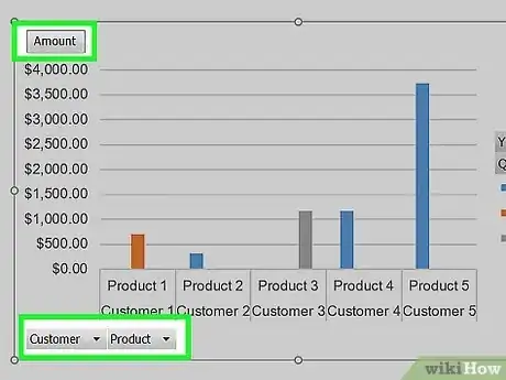
9Add data labels, axis titles and other information to your chart by right-clicking the relevant portion of the chart and choosing the options from the menu.
-
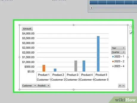
10Move your pivot chart anywhere in the workbook file you like.
- It can be placed in one corner of the source data sheet, on the same tab as the pivot table or on its own tab.

