This article was co-authored by wikiHow staff writer, Nicole Levine, MFA. Nicole Levine is a Technology Writer and Editor for wikiHow. She has more than 20 years of experience creating technical documentation and leading support teams at major web hosting and software companies. Nicole also holds an MFA in Creative Writing from Portland State University and teaches composition, fiction-writing, and zine-making at various institutions.
This article has been viewed 10,427 times.
Learn more...
Need to visualize more than one set of data on a single Excel graph or chart? This wikiHow article will show you the easiest ways to add new data to an existing bar or line graph, plus how to plot a second data set to compare two sets of similar linear data on a single graph.
Steps
Comparing Two Sets of Data on One Graph
-
1Open the sheet that contains your existing data. Use this method if you want to compare two sets of similar data on the same graph. For example, comparing sales for red t-shirts versus blue t-shirts in the same year.
- This method will create a second X and Y axis for the data you want to compare.
- If you want to combine a second data set with your existing data set rather than compare, see Adding More Data to a Graph on the Same Sheet or Adding More Data to Graph on a Different Sheet.
-
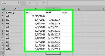
2Add your new data in a separate column and/or row. If you haven't already done so, add the second set of data you want to compare to the first set somewhere on the same sheet as your existing data. The cells do not have to be adjacent.Advertisement
-
3Right-click your chart and choose Select Data. This opens the Select Data Source dialog window.
- You can also click the graph once, select the Chart Design tab at the top, and then click Select Data on the toolbar at the top of Word.
-
4Click the Add button on the Select data Source window. You'll see it under the "Legend Entries (Series)" header.
-
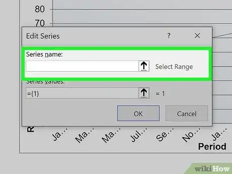
5Type a name for this data range in the "Series name" field. This is how your data will appear on the graph and legend.
- You can also click a cell that contains the name you want to use for this range to make that cell's value the name of the series.[1]
-
6Click the "Series X values" field. This activates the field.
-
7Use the mouse to select data for your second X axis. Once you lift your finger from the mouse, the range will appear in the "Series X values" field.
- For example, if a set of dates runs along the X axis of your original data, select the second set of dates for this X axis.
-
8Click the "Series Y values" field. This activates the Y axis field.
-
9Select the data you want to use for your second Y axis. Use the mouse to highlight the new data you want to add to this second Y axis.
- If you see an error when trying to select a set of data, delete everything in the field and select that range again.
-
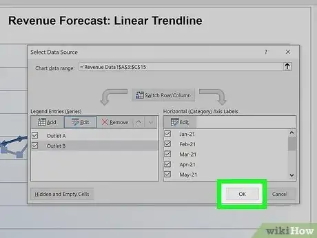
10Click OK. Now you'll see two different sets of data under "Legend Entries (Series)".
-
11Click OK to display the comparison data. Your graph now displays a comparison of two sets of data on the same chart.
Adding More Data to a Graph on the Same Sheet
-
1Open the sheet that contains your graph and data. Use this method if your graph and its existing data are on the same worksheet.
- This method will combine the second set of data with the original data on the existing axes.
-
2Click anywhere on the graph. When you click the graph, you'll see lines and sizing handles surrounding the data that's already included. The second series of data you've added is not yet highlighted.
-
3Drag the handles to select the new data. For example, if you added a new column of data to the right of the existing data, drag the rightmost handle to the right to include that column in the data selection range. The chart will update right away to reflect all of the data selected.
Adding More Data to Graph on a Different Sheet
-
1Open the sheet that contains your existing data. Use this method if your graph and data are on separate sheets.
- This method will combine the second set of data with the original data on the existing axes.
-
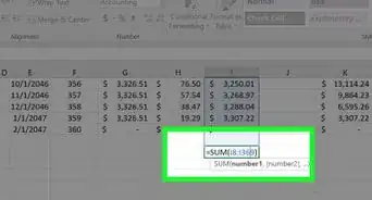
2Enter the new data next to your current data. Type the new data for your graph into the cells directly next to or below your current data.[2]
-
3Right-click your graph and choose Select Data. This opens the Select Data Source dialog window.
- You can also click the graph once, select the Chart Design tab at the top, and then click Select Data on the toolbar at the top of Word.
-
4Select all of the data you want to add. Leaving the Select Data Source window open, use the mouse to highlight all of the data you want to include in your chart, including the existing data.
- Once you select some data, the series will appear under "Legend Entries (Series)" on the left side of the Select Data Source window.
-
5Click OK on the Select Data Source window. This closes the dialog window and adds the second data set to your chart.
References
About This Article
1. Right-click the graph and select Select Data.
2. Click Add.
3. Type a name for the range.
4. Click the "Series X values" field and then select data for the X axis.
5. Click the "Series Y values" field and select data for the Y axis.
6. Click OK and then OK again.


