wikiHow is a “wiki,” similar to Wikipedia, which means that many of our articles are co-written by multiple authors. To create this article, 13 people, some anonymous, worked to edit and improve it over time.
This article has been viewed 172,384 times.
Learn more...
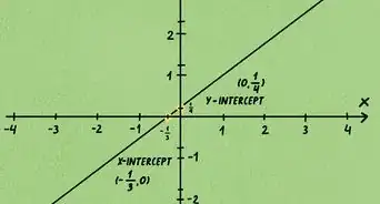
A graph is a diagram (as a series of one or more points, lines, line segments, curves, or areas) that represents the variation of a variable in comparison with that of one or more other variables. In other words, values displayed on a Cartesian coordinate system in various ways depending on what you are trying to demonstrate or determine.[1] Discrete data, such as the average price of cars from year to year, would be a represented as single points on the graph. The calculation is made only once for each year thus the data is discrete. The x axis would denote each year and the y axis would represent the average cost of cars for each year. A line graph would be useful for representing continuous data where every possible value on the x axis has a corresponding value on the y axis. For instance you might want to chart temperatures over time. You can take the temperature at any time so the data is continuous. When trying to calculate slope area, minimum and maximum of a function it is very helpful to draw a graph.
Steps
How to Draw a Graph
-
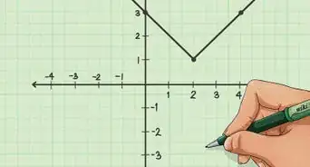
1Draw the x axis.
- Make a horizontal line on the paper.[2] You may draw arrows on the ends of the line to indicate it is a number line that continues past your data sample.
- Put the label "X" to the right of the line to indicate the x axis.
- Mark the center of the line with a vertical tick mark and label it 0. This is the origin of the graph.
- Make equally spaced tick marks on the rest of the x axis. For this example you should label the tick marks from 1 to 10 on the right side of the 0.
-
2Draw the y axis.
- Make a vertical line that passes through the origin of the x axis.
- Put the label "Y" above the line.
- Make equally spaced tick marks on the y axis. For this example you should label the tick marks from 2 to 20 above the 0.
Advertisement -
3Calculate the values of y for several values of x.
- We will be drawing a graph using the function f(x) = 2x. This means that y = 2x. For every possible value on the x axis there will be a corresponding value on the y axis.[3] To calculate the value of y, plug a number into x. If x= 3 then f(x) = 6. Only positive values will be used in this example.
- Set x = 0, 2, 4, 6, and 8. The corresponding y values are 0, 4, 8, 12, and 16. The result is a set of ordered pairs represented with the x, or abscissa, first and the y, or ordinate, second. For our example we will have five ordered pairs: (0,0), (2,4), (4,8), (6,12), and (8,16).
-
4Mark the ordered pairs on the graph.
- Count over on the x axis then count up on the y axis.[4] The value of y is marked on the graph above the x value.
-
5You have created a graph of the function f(x) = 2x.


Community Q&A
-
QuestionWhat is the difference between independent and dependent variables?
 DonaganTop AnswererThe value of a dependent variable depends on the value of some other variable. The value of an independent variable can be anything you choose and doesn't depend on the value of any other variable. For example, in the expression x = 3y, the value of y can be any number you choose and is therefore called an independent variable. However, the value of x would always be three times the value of y and is therefore dependent on y's value, which makes x a dependent variable.
 -
QuestionWhy does a graph exist?DonaganTop AnswererA graph is a quick way of displaying data.
-
QuestionWhat is the definition of graph plotting?
 Community AnswerA pictorial representation of two physical variables recorded by an experiment.


References
About This Article
Drawing a graph is a useful way of presenting mathematical equations. First, draw your X and Y axes at a right angle and label them. X is the horizontal axis and Y is the vertical one. Mark the intersection as 0 and write the scale for each axis along the line. Once you’ve drawn the axes, calculate the values of Y for several values of X. For example, if your equation is Y=2X, when X is 1, Y will be 2. Then, plot those points on your graph and connect them with a straight line. Label the line with your equation. For more tips, including how to mark ordered pairs on your graph, read on!