This article was co-authored by wikiHow staff writer, Nicole Levine, MFA. Nicole Levine is a Technology Writer and Editor for wikiHow. She has more than 20 years of experience creating technical documentation and leading support teams at major web hosting and software companies. Nicole also holds an MFA in Creative Writing from Portland State University and teaches composition, fiction-writing, and zine-making at various institutions.
This article has been viewed 362,614 times.
Learn more...
An S (sigmoid) curve is a visual representation of data over time. When creating an S curve, you'll always have one column or row dedicated to a time period, such as months, quarters, or years. Your other data (such as income, time, or money spent) will display as a "curve" over that time period, which can help you identify trends and target new strategies. This wikiHow teaches you how to use Microsoft Excel to create an S curve.
Things You Should Know
- Dedicate one row or column for denoting the time period for your data.
- Highlight the data, go to the Insert tab, and select either the Line or Scatter chart.
- Customize the chart title, data labels, trendline, and more!
Steps
-
1Enter your chart data. Since an S curve shows data over a period of time, make sure to reserve one row or column for denoting the time period. For example, let's say you wanted to show an S curve of new accounts over the course of twelve months. It may look something like this:
New Accounts 2020 A B C D E F G H I J K L M 1 JAN FEB MAR APR MAY JUN JUL AUG SEP OCT NOV DEC 2 New 54 62 74 390 420 90 800 151 220 130 145 280 3 Total 54 116 190 580 1000 1090 1890 2041 2261 2391 2536 2816 - In this example, the formula we use to get the value of C3 (The February cumulative total of 116) is =B3+C2, which adds the monthly sign-ups from February to the previous cumulative amount of 54. Similarly, the March cumulative total is calculated using =D2+C3.
-
2Highlight the data. Be sure to include column and row headers. All selected data will be added to the chart.Advertisement
-
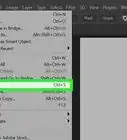
3Click the Insert tab. It's above the toolbar at the top of Excel.
-
4Select a chart type. You'll see several icons and menus in the "Charts" panel at the top of Excel, and hovering your mouse cursor over them will display what kind of charts are inside. You can create an S curve on a Line or Scatter chart.[1] Once you select a chart, your S curve will appear, illustrating growth and loss over time.
- To see your line as a nice smooth curve, go with a Scatter chart. To do this, click the icon with several blue and black dots scattered over a right angle, and then select the Scatter with Smooth Lines option.
- To insert a regular Line chart (it won't be smooth/curved but it definitely displays the correct data on a line), click the icon with overlapping blue and black lines with dots at each point. You can then choose any of the charts in the "2-D Line" or "3-D Line section."
-
5Customize your chart. Now that your S curve appears on the chart, you can edit it as you see fit.
- To edit the title of your chart, double-click Chart Title and type a new name.
- Click the + next to your chart to customize elements. Some especially helpful elements you might edit are Data Labels (to plot the values on the curve), Data Table (to show the raw data at the bottom), and Trendline (to show trends on any variable).
- Click the paintbrush icon next to your chart to choose different styles and colors. Some of the different styles provide additional helpful information for interpreting your data.
- Click the funnel icon next to the chart to choose which data you want to see on your chart. For example, if you only want to see the S curve for cumulative data, you can remove the checkmark from the monthly entries.


About This Article

To create a basic S curve in Excel, start by entering your data into your workbook. One line or column must be dedicated to a time (such as a row of months), and another should contain data that changed over that time period. Once entered, highlight the selected data and click the Insert tab. On the Charts panel, select a Line or Scatter chart to display your S curve. You can edit your chart using the icons to its right.