X
wikiHow is a “wiki,” similar to Wikipedia, which means that many of our articles are co-written by multiple authors. To create this article, 13 people, some anonymous, worked to edit and improve it over time.
This article has been viewed 182,494 times.
Learn more...
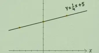
Line graphs and bar graphs are both visual ways of representing two or more data sets and their interrelation. In other words, graphs are pictures that show you how one thing changes in relation to another. Learning to read graphs properly is a matter of interpreting which pieces of information go together.
Steps
-
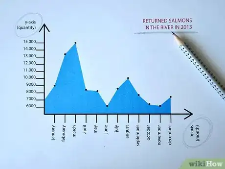
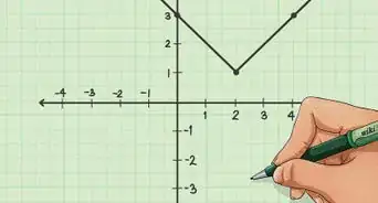
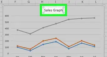
1Identify what the graph represents. Most graphs will have a clearly labeled x-element, spaced along the graph's horizontal axis, and a clearly labeled y-element, spaced along the graph's vertical axis.[1]
- The graph's title should also tell you exactly what it's about.
-
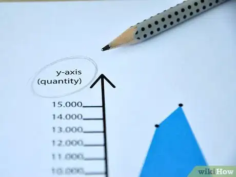
2Check the scale for each graph element. This applies to both line graphs and bar graphs.[2]
- For example, if you're looking at a graph that shows how many salmon returned to a given stream over the period of a few months last year, each increment along the graph's y-axis might represent hundreds, thousands or tens of thousands of salmon returning; you won't know which scale numbers apply until you check the graph.
Advertisement -
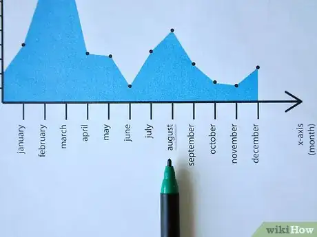
3Locate the graph element you want information on.[3]
- For example, you might want to know how many salmon returned to the stream in question in August of last year. So you'd read across the graph's horizontal axis until you find "August."
- Time elements, such as days, weeks, months or years, are almost always listed along the horizontal ("x") axis. Quantity measurements are almost always listed along the vertical ("y") axis.
-
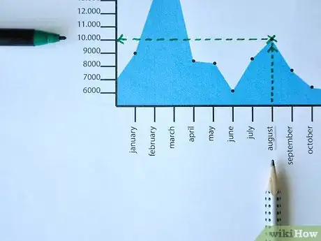
4Read directly up from "August" until you find a dot or a slanting line, on a line graph, or the top of a bar for a bar graph. Then read straight across to the left until you hit the graph's labeled y-axis.[4] Whatever quantity that line intersects with is the measurement for salmon return in August.
- So if you read up to the dot, line or top of the bar for salmon in August then read across to the left and hit "10,000," you know 10,000 salmon returned in August. If you hit a point between any two labeled graph increments, you have to estimate based on where you land between the 2 increments. For example, if you hit a point halfway between 10,000 and 15,000, you can safely estimate that the correct number is about 12,500.
Advertisement
Community Q&A
-
QuestionHow do I graph 1920 population is 65,000; 1924 population is 100,000; 1925 population is 60,000?
 DonaganTop AnswererLet the x-axis be one set of numbers (say, the years), and let the y-axis be the other set of numbers (say, the populations). Plot the points corresponding to each pair of numbers (a given year and its population).
 -
QuestionWhat is the trend when both variables increase?
 DonaganTop AnswererThe trend is represented by a line moving up from left to right.
 -
QuestionWhat is a coefficient?
 Community AnswerA coefficient is a numerical or constant quantity placed before and multiplying the variable in an algebraic expression.
Advertisement
References
- ↑ https://www.education.vic.gov.au/school/teachers/teachingresources/discipline/english/literacy/Pages/interpreting-graphs.aspx
- ↑ https://www.youtube.com/watch?v=1OTL1h1dx5M
- ↑ https://sciencing.com/interpret-graphs-charts-6930975.html
- ↑ https://courses.lumenlearning.com/waymaker-level1-english-gen/chapter/1-3-2-text-how-to-read-graphs/
- ↑ https://www.ck12.org/statistics/line-graphs/lesson/line-graphs-bsc-pst/
About This Article
Advertisement
