This article was co-authored by wikiHow Staff. Our trained team of editors and researchers validate articles for accuracy and comprehensiveness. wikiHow's Content Management Team carefully monitors the work from our editorial staff to ensure that each article is backed by trusted research and meets our high quality standards.
This article has been viewed 21,628 times.
Learn more...
If you’re giving a presentation for school, work, or any other reason, using a PowerPoint is a great choice. Presenting a PowerPoint is a good way to enhance a presentation with additional images, key text, and structure. However, sometimes the idea of giving a PowerPoint presentation is a little nerve-wracking. Luckily, the process of creating and presenting a PowerPoint is a lot simpler than you might think!
Steps
Creating Your Presentation
-
1Make a plan for how your PowerPoint will enhance your presentation. The PowerPoint should complement what you’re saying, not replace it. After you determine what all you want to say in your presentation, decide how each point you make can be enhanced by a PowerPoint slide. Then, create those slides![1]
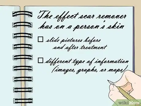
- For instance, if you want to make a point about the effect scar remover has on a person’s skin, the slide you use to complement this point could have before and after pictures of a scar that’s been treated with the remover.
- Once you know what your presentation will be about, make a list of the different type of information (e.g., images, graphs, or maps) that you might want to put on your PowerPoint slides to make your presentation better.
-
2Organize your PowerPoint slides to have a logical flow between them. Use your PowerPoint to tell a story or some kind of narrative about the information that you’re presenting. Make sure that each slide logically flows into the next one.[2]
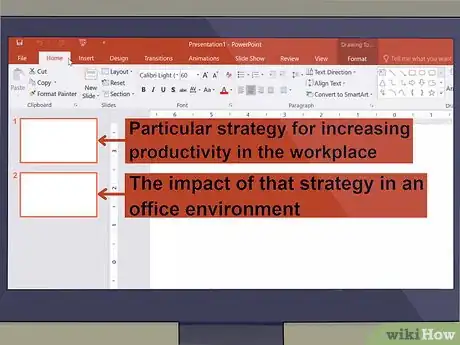
- For example, if one of your slides is detailing a particular strategy for increasing productivity in the workplace, the next slide could describe the impact of using that strategy in an office environment.
- Even if your presentation is largely composed of a lot of data, be sure to talk about the underlying meaning that that data carries.
Advertisement -
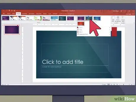
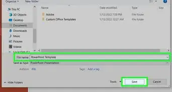
3Choose a consistent design template for your slides. Use a consistent font, background, and color scheme across the entire PowerPoint presentation. Feel free to present the information in different ways, such as using a numbered list on 1 slide and an image on another, but don’t distract your audience by constantly changing the underlying design.[3]
- Use a relatively large sans serif font on all of your slides. This will not only minimize distraction, but also make it easier for people to see the text on your slides.
- Make sure to have some contrast between the background color and the color of your text. This will make it easier for people to actually see what you write on the slides!
-
4Limit the amount of words you put on each slide. Include only key words and essential information that people absolutely need to see. Otherwise, the audience will focus too much of their attention on reading your slides instead of listening to what you’re saying.[4]
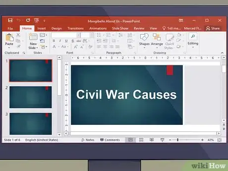
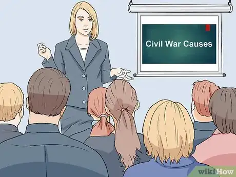
- For example, instead of writing “There are a wide variety of factors that helped to bring about the American Civil War,” write something short like “Civil War Causes.”
- You should never have full paragraphs of text on your slides. If possible, avoid even having full sentences on them.
-
5Be sure to include a few images, but don’t use too many. Include visuals on your slides when they actively contribute to and enhance the point you’re trying to make. However, they can become distracting if you crowd your slides with them, so only add images if they’re serving a purpose.[5]
- For example, if you’re giving a presentation on how the price of pie has changed, you don’t need to add a stock photo of pie to the slide.
-
6Write a rough script to accompany your PowerPoint. Do not write what you intend to say on the slides themselves. Instead, have a separate verbal presentation that you’ll use in tandem with what is presented on the PowerPoint slides.[6]
- Note, however, that you should not read directly from a script, either. The script should only be a rough outline for you to follow as you give your presentation.
Giving the Presentation
-
1Practice your presentation ahead of time to make yourself less nervous. For best results, do a practice run in front of a live audience to better simulate what it will be like presenting your PowerPoint to other people. At the very least, make sure you practice saying the words that will accompany each slide.[7]
- If possible, do this practice run on the same technology and in the same room that you’ll give your actual presentation. This way, you’ll be able to see if there are any technical issues with your presentation.
-
2Make eye contact with the audience and don’t stare at the slides. If you’re presenting to a relatively small crowd, make eye contact with each individual member of the audience at some point in the presentation. If you’re presenting to a large crowd, pick 3 or 4 people in different areas of the room and shift your gaze between them.[8]
- This is one of the best ways of keeping your audience engaged with your presentation.
- If you’re presenting to a very large crowd, you can also focus your gaze on the horizon instead of on individual audience members.
-
3Keep your arms up and move around a bit while you present. Use your body language to accentuate the points that you’re trying to make. Make gestures and facial expressions that will augment what you’re saying and help drive the point home to the audience.[9]
- If you don’t feel comfortable using your body language this way, you should still try to keep your arms up and move around a little bit. This will help keep the audience engaged and interested.
- Never cross your arms or put your hands in your pockets!
-
4Speak slowly and clearly so everyone can understand you. If you have a tendency to get nervous during presentations and talk quickly, remember to take a deep breath and concentrate on getting your words out at the proper pace. If you’re speaking to a large room, make sure you’re projecting your voice enough so people in the back can hear you.[10]
-
5Interact with the audience to keep them engaged. Ask questions and be willing to pause your presentation to answer questions from the audience. It’s hard for people to give their undivided attention for longer than about 30 minutes, so try to find ways to keep them engaged with the content of your presentation.[11]
- For example, if you’re giving a presentation for a sales pitch, pass around models of the item you’re trying to sell.
Avoiding Common Mistakes
-
1Refrain from using animation or sound effects in your slides. Unless your presentation is meant to be comical, these types of effects might make your audience take your presentation less seriously. Make sure you’re presenting information in a formal, professional way.[12]
- Usually, it’s best to have all the information on a slide appear at the same time when you click the mouse. You should only “build” the slide (i.e., have a single line of text or image appear each time you click the mouse) if you’re building to a bigger point.
-
2Don’t try to cram a lot of information onto a single slide. This will make your slides seem overwhelming and distracting; remember, the audience’s attention should be on you. Try to keep about 25-50% of the space on each slide empty.[13]
- Stick with a “less is more” approach to making slides whenever possible. It’s more impactful to have a single word or image on a slide than to fill the entire slide with text.
-
3Avoid reading off of the slides during your presentation. Your presentation will feel very dull and your audience will be quick to lose interest. Always maintain a more conversational tone while you’re speaking and keep the audience’s attention on you.[14]
-
4Stick to a schedule and avoid going over your allotted time. Keep an eye on the clock and always be aware of how much time you have left to cover the rest of your slides. If you need to, be willing to skip some slides for the sake of time.[15]
References
- ↑ https://www.forbes.com/sites/quora/2016/09/22/10-smart-ways-to-make-any-powerpoint-presentation-way-more-interesting/#4cc872832d24
- ↑ https://www.participoll.com/powerpoint-presentation-tips/
- ↑ http://www.ncsl.org/legislators-staff/legislative-staff/legislative-staff-coordinating-committee/tips-for-making-effective-powerpoint-presentations.aspx
- ↑ http://www.ncsl.org/legislators-staff/legislative-staff/legislative-staff-coordinating-committee/tips-for-making-effective-powerpoint-presentations.aspx
- ↑ https://business.tutsplus.com/tutorials/how-to-make-and-give-great-powerpoint-presentations--cms-28734
- ↑ https://www.forbes.com/sites/quora/2016/09/22/10-smart-ways-to-make-any-powerpoint-presentation-way-more-interesting/#4cc872832d24
- ↑ https://www.participoll.com/powerpoint-presentation-tips/
- ↑ https://www.princeton.edu/~archss/webpdfs08/BaharMartonosi.pdf
- ↑ https://www.participoll.com/powerpoint-presentation-tips/
- ↑ http://www.ncsl.org/legislators-staff/legislative-staff/legislative-staff-coordinating-committee/tips-for-making-effective-powerpoint-presentations.aspx
- ↑ https://www.forbes.com/sites/quora/2016/09/22/10-smart-ways-to-make-any-powerpoint-presentation-way-more-interesting/#4cc872832d24
- ↑ http://www.d.umn.edu/~jgallian/goodPPtalk.pdf
- ↑ https://www.princeton.edu/~archss/webpdfs08/BaharMartonosi.pdf
- ↑ https://www.princeton.edu/~archss/webpdfs08/BaharMartonosi.pdf
- ↑ https://www.princeton.edu/~archss/webpdfs08/BaharMartonosi.pdf
