This article was co-authored by wikiHow staff writer, Travis Boylls. Travis Boylls is a Technology Writer and Editor for wikiHow. Travis has experience writing technology-related articles, providing software customer service, and in graphic design. He specializes in Windows, macOS, Android, iOS, and Linux platforms. He studied graphic design at Pikes Peak Community College.
The wikiHow Tech Team also followed the article's instructions and verified that they work.
This article has been viewed 62,198 times.
Learn more...
Adobe Illustrator is often used to make logos, backgrounds, cartoon drawings, and more. You can also use Illustrator's graph tool to create vibrant graphs and charts. This is very useful when designing business pamphlets, print ads, reports, and presentations. This wikiHow article teaches you how to use the graph tool in Adobe Illustrator.
Steps
-
1Open an Adobe Illustrator document. Adobe Illustrator files have a (.ai) file extension. Click an Adobe Illustrator file to open the file in Adobe Illustrator file. Alternatively, you can open Adobe Illustrator by clicking the yellow square icon that says "Ai" in the middle. Then click New to create a new file. Select the size of the document you want to create and click Ok.
- You can also open or create a new file at any time in Adobe Illustrator by clicking File in the menu bar at the top, and then click New to create a new file, or Open to open an Illustrator file.
-
2Click and hold the graph tool icon. It's in the toolbar to the left. It has an icon that resembles a bar chart. Clicking this icon selects the column graph tool. Clicking and holding this icon displays a sub-menu which contains a variety of graph tools you can use.Advertisement
-
3Click a graph tool. Click the graph tool that corresponds to the type of graph you want to create. Your options are as follows:
- Column graph tool: The column graph tool has an icon that resembles bars standing vertically. This tool is used to create a bar graph with vertical bars
- Stacked column graph tool: The column graph tool has an icon that resembles vertical bars stack on top of each other. The stacked column graph tool is used to create a bar graph with vertical bars that are stacked on top of each other. This is useful for demonstrating the differences in the values on the graph.
- Bar Graph Tool: The bar graph tool has an icon that resembles a bar graph with horizontal bars. It's very similar to the bar column graph tool, only it creates horizontal bars instead of vertical bars.
- Stacked Bar Graph Tool: The stacked bar graph tool has an icon that resembles horizontal bars placed next to each other. This is similar to the stacked column graph tool, only it creates horizontal bars instead of vertical bars.
- Line Graph Tool: The line graph tool has an icon that resembles a chart with a zig-zag line. This is used to plot points on a graph that are connected with a line.
- Area Graph Tool: The area graph tool has an icon that resembles two lines on a chart with the area in between them shaded. This is similar to a line graph chart, only it shades the area beneath the line in the chart.
- Scatter graph tool: The scatter graph tool has an icon that resembles a chart with dots scattered all over it. This is used to plot points on a chart without connecting them with a line.
- Pie Graph Tool: This has an icon that resembles a circle divided into 3 parts. This is used to create a pie chart, which is useful for showing percentages.
- Radar Graph Tool: The radar graph tool has an icon that resembles a shape on a circle. Radar graphs are useful for showing multiple variables for a single object (or more than one object).
-
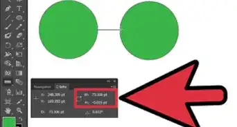
4Click and drag where you want to place the graph. This draws out the area where the graph will be placed.
- To draw a graph that is centered where you initially click, hold Alt (Windows) or Option (Mac) while you click and drag.
- Hold Shift while you click and drag to create a chart that is a perfect square.
- To create a graph that has specific dimensions, single-click where you want the graph to go. Then enter the exact hight and width of the graph in which ever units your document settings are set to. Then click Ok.
-
5Enter the values of the chart in the table. After you draw the chart, a table will appear. Click one of the cells in the table and enter a numeric value in the bar at the top of the table. Different graph types may look better or worse if the values are entered in the horizontal rows or vertical columns.
- If a chart doesn't look right when the values are entered into the table either vertically or horizontally, click the icon that resembles a bar switching from horizontal to vertical. It's at the top of the table. This switches the data from the horizontal rows to the vertical columns and vise-versa.
-
6
-
7Label the graph. You can use the text tool to add labels to the graph. Click the icon that resembles a capital "T" in the toolbar to the left. Then click where you want to place a label. Type what you want the label to say.
- If you want to add vertical text to a chart, click and hold the "T" icon in the toolbar and then click the vertical text tool. This is useful to adding text down the "Y" axis of a chart.
-
8Change the color of the graph. You can change the color of objects in a graph using the sub-select tool. To do so, press A on the keyboard or click the icon that resembles a white arrow in toolbar to the left. The click the line or shaded area in the graph. Click the fill or stroke box in the upper-right corner and click a color you want.
- The fill box changes the color of a shape. It's the box that resembles a colored square. The stroke box changes the color of a line around a shape. It's the box that resembles a line around a white square.[1]


About This Article