Excel 2000
Creating a Chart
Types of Charts
Excel offers a variety of ways to chart your data.
![]() Think of a chart as a tool that helps people visualize data. Charts deliver information more quickly and easily than a column of numbers in a worksheet, especially to people sitting in the audience for a presentation. Choosing the right kind of chart for your data can really help get your point across.
Think of a chart as a tool that helps people visualize data. Charts deliver information more quickly and easily than a column of numbers in a worksheet, especially to people sitting in the audience for a presentation. Choosing the right kind of chart for your data can really help get your point across.
Some of the most common charts:
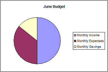
Pie Chart
Shows the relationship of parts to a whole. If the pie is the sum of the source data, each slice of the pie represents an individual number.
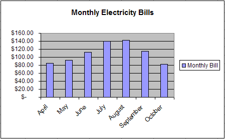
Column or Bar Chart
Useful to follow trends or to compare numbers. Each column represents a particular value. A bar chart is a horizontal version of a column chart.
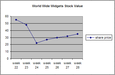
Line Chart
Most useful for tracking trends over time. They make it very easy to study the rise or decline of a particular item. A variation of the line chart is the area chart where the area under the line is shaded a particular color.