

Excel 2000
Creating a Chart
Chart Basics
Have you ever read something you didn't fully understand but when you saw a chart or graph, the concept became clear and understandable? Microsoft Excel 2000 has a chart feature you can use to help explain data. Many people find that a picture helps when they are trying to understand the significance of a list of numbers.
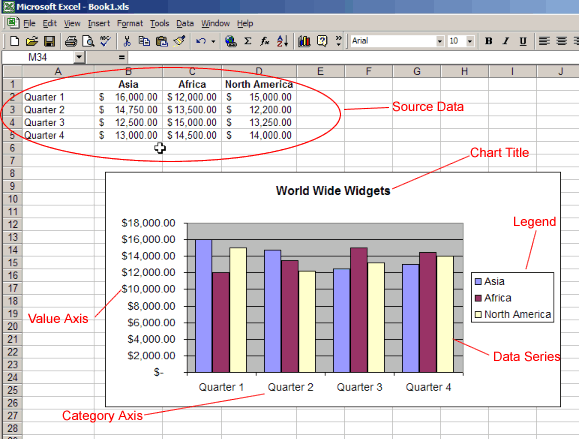
Source Data
The range of cells that make up a chart.
Title
The title of the chart.
Legend
Think of this as the key to the chart. This shows what each of the colors on the chart represents.
Axis
Refers to the vertical and horizontal parts of a chart. The vertical axis is often referred to as the y axis, and the horizontal axis is referred to as the x axis.
Data Series
The actual charted values. These are usually the rows or columns of the source data.
Value Axis
The axis that represents the values or units of the source data.
Category Axis
The axis identifying each data series.


