

Excel 2000
Creating a Chart
Introduction
By the end of this lesson, learners should be able to:
- Identify the parts of a chart
- Identify different types of charts
- Create an Embedded Chart
- Create a Chart Sheet
Chart Basics
Have you ever read something you didn't fully understand but when you saw a chart or graph, the concept became clear and understandable? Microsoft Excel 2000 has a chart feature you can use to help explain data. Many people find that a picture helps when they are trying to understand the significance of a list of numbers.
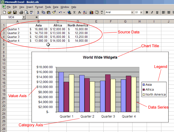
Source Data
The range of cells that make up a chart.
Title
The title of the chart.
Legend
Think of this as the key to the chart. This shows what each of the colors on the chart represents.
Axis
Refers to the vertical and horizontal parts of a chart. The vertical axis is often referred to as the y axis, and the horizontal axis is referred to as the x axis.
Data Series
The actual charted values. These are usually the rows or columns of the source data.
Value Axis
The axis that represents the values or units of the source data.
Category Axis
The axis identifying each data series.
Types of Charts
Excel offers a variety of ways to chart your data.
![]() Think of a chart as a tool that helps people visualize data. Charts deliver information more quickly and easily than a column of numbers in a worksheet, especially to people sitting in the audience for a presentation. Choosing the right kind of chart for your data can really help get your point across.
Think of a chart as a tool that helps people visualize data. Charts deliver information more quickly and easily than a column of numbers in a worksheet, especially to people sitting in the audience for a presentation. Choosing the right kind of chart for your data can really help get your point across.
Some of the most common charts:
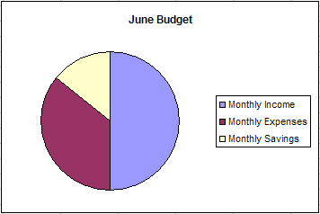
Pie Chart
Shows the relationship of parts to a whole. If the pie is the sum of the source data, each slice of the pie represents an individual number.
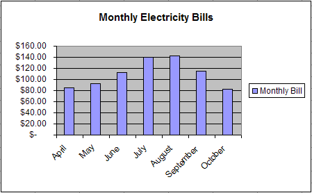
Column or Bar Chart
Useful to follow trends or to compare numbers. Each column represents a particular value. A bar chart is a horizontal version of a column chart.
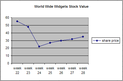
Line Chart
Most useful for tracking trends over time. They make it very easy to study the rise or decline of a particular item. A variation of the line chart is the area chart where the area under the line is shaded a particular color.
The Chart Toolbar
Excel 2000 provides a number of ways to work with charts. The quickest way to create and edit your charts is to use the Chart Toolbar.
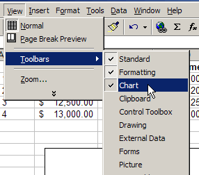
To show the Chart Toolbar:
- Choose View
 Toolbars Chart.
Parts of the Chart Toolbar:
<!!-- IMAGE | CLASSES -->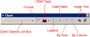
Chart Objects List Box
Allows you to select the individual parts of your chart.
Format Button
Allows you to format the current selection.
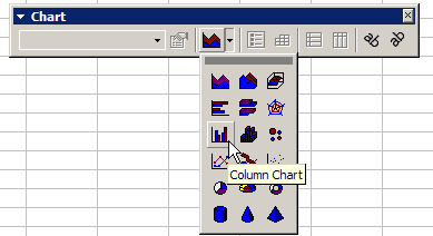
Chart Type
Use this to select the type of chart.
Legend
Show or hide the chart legend.
Data Table
Show or hide the actual data used to create the chart.
By Row
Displays the Y-axis using the row labels.
By Column
Displays the X-Axis using the column labels.
Angle Text
Use these to change the angle of the x and y axis labels.
Creating an Embedded Chart
Embedded charts are charts that reside on the same worksheet as the source data.
To embed a chart in a worksheet:
- Choose View
Toolbars
Chart.
- Select the range of cells that you want to chart. Your source data should include at least three categories or numbers.
- On the chart toolbar, click the chart type pull down and select the chart that you would like to use.
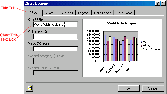
- To add a title to your chart, open the chart options dialog box: Chart
Options.
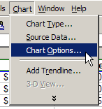
- Select the titles tab and enter your title in the Chart Title text box.
![]() Keep in mind that different charts will work best with different data. For example, a pie chart can only display one data series at a time.
Keep in mind that different charts will work best with different data. For example, a pie chart can only display one data series at a time.
Creating a Chart Sheet
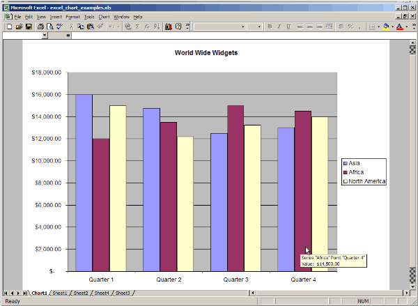
Although Excel creates an embedded chart by default, in some situations you may want to place a chart on a separate sheet. A separate sheet with a chart on it is called a Chart Sheet . Chart sheets can make your charts stand out, particularly when you are working with very complicated spreadsheets.
To move an embedded chart to a Chart Sheet:
- Select the chart that you would like to move.
- Choose ChartLocation.
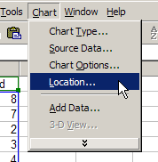
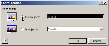
- In the Chart Location dialog box, select the As a new sheet radio button.
- Click OK.
Your chart should now display on a separate Chart Sheet in your Workbook:
![]() You can also use the Chart Location dialog box to rename the Chart Sheet.
You can also use the Chart Location dialog box to rename the Chart Sheet.
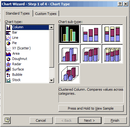
The Chart Wizard
Excel 2000 also includes a Chart Wizard which will take you through the steps for creating a chart.
To use the Chart Wizard:
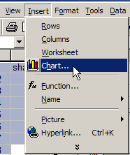
- Select the range of data that you would like to chart.
- Choose Insert Chart. <!!-- IMAGE | CLASSES -->
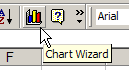
- Or, press the chart button on the standard toolbar. <!!-- IMAGE | CLASSES -->
- Follow the directions in the Chart Wizard. <!!-- IMAGE | CLASSES -->
Challenge!
- Create some source data (or use a worksheet that you have already created).
- Create the following charts using the source data.
- Pie Chart
- Line Chart
- Column or Bar Chart
- Move one of your charts to a separate chart sheet.
![]() Which chart does the best job of explaining your data?
Which chart does the best job of explaining your data?