This article was co-authored by wikiHow staff writer, Megaera Lorenz, PhD. Megaera Lorenz is an Egyptologist and Writer with over 20 years of experience in public education. In 2017, she graduated with her PhD in Egyptology from The University of Chicago, where she served for several years as a content advisor and program facilitator for the Oriental Institute Museum’s Public Education office. She has also developed and taught Egyptology courses at The University of Chicago and Loyola University Chicago.
There are 18 references cited in this article, which can be found at the bottom of the page.
This article has been viewed 11,848 times.
Learn more...
Whether you’re writing a research paper for class, composing an article for a newsletter, or trying to create the perfect cover letter, you’ll want your Word doc to look as polished and professional as possible. Fortunately, Word gives you all the tools you need to make your documents stand out and look great. In this article, we’ll talk you through the basics—like how to adjust your font or pick the right paragraph style—as well as some more advanced tips and tricks, like turning on hidden formatting marks.
Steps
Formatting Basics
-
1Pick a serif font for a print document. Serif fonts have extra strokes on the ends of the letters, which make the text look a little more decorative and elegant. Some typography pros also believe that serif fonts are easier to read in print. If you’re planning to print out your document, choose a classic serif font, such as Times New Roman, Book Antiqua, or Georgia.[1]
- To choose a font, go to the Home tab at the top of your document. Select the font you like best from the drop-down font menu at the right side of the menu ribbon.
- There are hundreds of fonts to choose from, but try to stick to fonts with a simple, classic look to keep your document looking professional and easy to read. Avoid anything overly elaborate or artsy.
-
2Go with a sans-serif font for digital documents. Sans-serif fonts lack the little decorative feet that serif fonts have. Many typography experts believe that they are easier to read on digital screens than serif fonts. If you’re not planning to print your document out, go with a classic sans-serif font such as Verdana, Lucida, or Calibri.[2]
- While Comic Sans is a popular and easy-to-read sans-serif font, it’s gained a bit of a bad rap for looking childish and unprofessional. Avoid using comic sans if you want your doc to have a polished and mature look.
Advertisement -
3Break up your text with headings. Headings are subsection titles that you can insert throughout the document to clearly mark each section. They not only make your text look nice, but they also make it much easier for people using screen readers to navigate your document.[3] To insert a heading into your document:
- Type the text you’d like to use for a heading. For instance, you might write something like “Section 1” or “Introduction.”
- Select the heading text.
- Open the Home tab and go to the Styles section of the ribbon menu, at the top right side of the document.
- Select the heading style you want from the list of styles. For instance, if you’re creating a top-level heading, select Heading 1. For subheadings, choose Heading 2 or Heading 3.
-
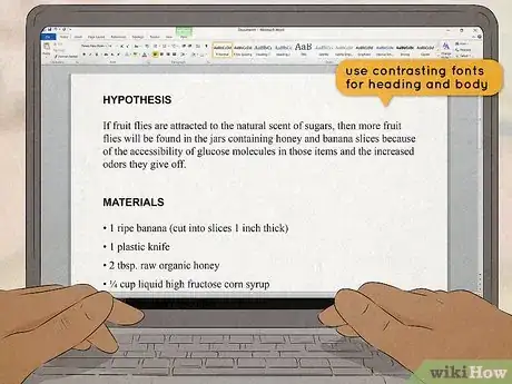
4Use contrasting fonts for headings and main text. Headings are usually bigger than the main body text, which helps them stand out. However, they’ll also stick out more and look more visually interesting if you use a different font for headings than the rest of the text. While Word usually uses a different font for headings by default (for example, Calibri Light versus regular Calibri), feel free to experiment with choosing your own Headings font.[4]
- It works well to combine serif fonts in the headings with sans-serif fonts in the body of your document. For instance, you might use Didot for your headings and Gill Sans for the body text.
- If you don’t want to change the font of each heading manually, go to the Home tab and open the Styles Pane. Select the drop-down menu for the heading style you want, choose Modify Style… and select the font you want.
-
5Align your paragraphs left. Typically, left alignment is the default setting for Word documents. If the settings have been changed, you can reset the alignment by opening the Home pane and selecting left alignment from the formatting section in the middle of the ribbon menu at the top of the document. The alignment buttons are located right under the list format buttons. Choose the one at far left, which looks like a series of lines that are even on the left side and uneven on the right.[5]
- You can also change the text alignment by going to the Format menu at the top of your screen and picking Paragraph from the drop-down list. Set the alignment to Left in the general settings menu.
- While left alignment looks best in most cases, there are exceptions. For instance, you will typically center the title and author lines at the top of a paper. You might also choose to center your headings.
- In most cases, it’s best to avoid using the “justify” alignment, which makes the text even on both the right and left sides. This formatting style works best in documents written in narrow columns, like brochures, magazine articles, and newsletters.[6]
-
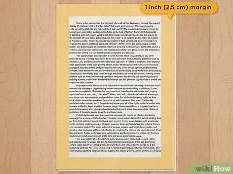
6Set the margins to at least 1 inch (2.5 cm). The margin settings determine how much space there is between your text and the edge of the page. By default, the margins in Word documents are set to 1 inch (2.5 cm) on each side. However, sometimes a bigger margin looks better. For instance, margins that are 1.5 inches (3.8 cm) wide are a good choice for cover letters.[7] To change the margin size, choose the Layout tab from the top of your document and select Margins at far right. Select one of the presets or choose custom margins, then enter whatever numbers you like.
- Word’s default combination of 12-point font size and 1 in (2.5 cm) margin size is required by a lot of professional citation and formatting styles, like APA and MLA.[8] If you’re completing a writing assignment for class or a publication, check the guidelines about margins and font size.
- While you can make your margins smaller, your document will be less readable and pleasant to look at if the text crowds the edges of the page.
-
7Indent the first line of each paragraph if your style requires it. If your document is one solid block of text, readers will quickly get tired of looking at it. One traditional way to deal with this is to use paragraph indents. The easiest way to do this is to simply hit ⏎ Return when you’re ready to start a new paragraph, then hit the Tab ↹ key to create an indent at the start of the new line. The default indent in Word is .5 inches (1.3 cm), which is the size of indent required by many standard formatting styles (such as APA and MLA).[9]
- You can also use the Layout tab in Word to automatically indent each paragraph. Set the Indent setting in the middle of the ribbon menu to the desired size. For example, set the Left indent to .5 inches (1.3 cm). Every time you hit ⏎ Return to start a new paragraph, it will be automatically indented.
- You can also make these adjustments by opening up Paragraph… in the Format dropdown menu. Set the exact indent size you want in the Indentation section of the settings window.
- If you’d rather use Tab ↹ to indent each paragraph, you can also adjust the tab stop setting to change the size of the indent. Go to the Home tab and click the Increase Indent or Decrease Indent buttons in the central paragraph section of the ribbon menu.[10]
-
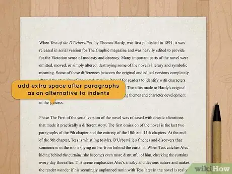
8Add extra space after paragraphs as an alternative to indents. For some types of documents, like cover letters, paragraph indents have gone out of style. If you’d prefer to give your document a more modern look, skip the indents and use paragraph spacing instead.[11] To do this, go to the Home tab at the top of your document and select the Line and Paragraph Spacing button. A window will open where you can adjust your paragraph spacing settings. Enter how many points of space you would like to add after each paragraph—typically about 6 to 8 points.[12]
- You can also simply hit ⏎ Return twice after each paragraph to create an extra line space.
- To apply your preferred paragraph spacing automatically to the whole document, change the paragraph spacing settings in the Layout tab.
- Alternatively, go to the Design tab at the top of your document and select the Paragraph Spacing dropdown menu. Select the preset spacing you want to automatically apply the style to your entire document.
-
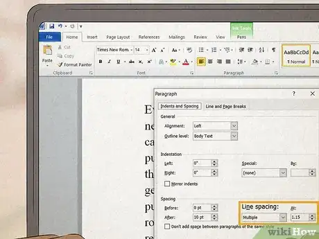
9Follow line spacing requirements. If you’re writing a paper for class, your instructor may require double spacing. Some standard formatting styles, such as MLA, also specify that you must double-space your text.[13] On the other hand, it’s best to single-space certain other types of documents, such as cover letters.[14] Whatever kind of spacing is required for the document you’re writing, you can set the spacing in the Home tab at the top of your Word document. Go to the Line Spacing Options menu in the Paragraph section of the ribbon menu and select the spacing you want from the dropdown.[15]
- If you’ve already started writing your document, you’ll need to select the text you want to format first. Otherwise, simply set your line spacing before you start writing.
- If your document doesn’t have any particular spacing requirements, you can still adjust the spacing to make it easier to look at. Open the Line Spacing menu in the Home tab to enter a custom amount of space between each line (such as 1.08 spaces).[16]
Advanced Techniques
-
1Turn on formatting marks to easily spot and fix problems. You may not realize it, but every Word document you type is full of hidden formatting marks. To see them, simply open the Home tab and hit the paragraph symbol button in the middle section of the ribbon menu at the top of your document. This will reveal things like paragraph markers, spaces between characters, tab marks, and section and page breaks that you might not have realized were there.[17]
- If you find a problem—such as a paragraph marker where there’s not supposed to be one—you can simply delete it to resolve any troublesome formatting issues. For instance, blank paragraphs can sometimes cause unwanted extra pages to appear in your document with no content.
- You can even fine-tune which formatting marks are visible, if you like. In Word for Windows, go to the File menu, then open Options and select Display. Go to the Always show these formatting marks on the screen section to select which marks you want to see.
- If you’re using a Mac, go to the Word menu, then open Preferences and select View. Select the marks you want to see under Show Non-Printing Characters.
-
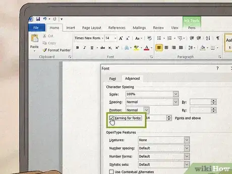
2Use the kerning feature to improve how your text looks. “Kerning” is a way to adjust the spacing between letters in your document. Most of the time, this is something you don’t have to worry about. However, in certain fonts, some letters or characters can look a little awkward side by side with the default spacing—such as “A” and “Y,” for example. To adjust the kerning in Word:[18]
- Open the Format menu and select Font. Select the Advanced tab and check the box next to Kerning for fonts.
- In the Points and above box, adjust the point size you want the kerning to apply to. It should automatically fill in the current point size for the font you’re using.
-
3Enable smart quotes. Word has a variety of Auto Formatting options that can make your life easier and keep your documents looking professional. One of the most helpful auto formatting options you can turn on is smart quotes, which will automatically format your quotation marks so that they face in the right direction at the beginning and end of each quote. To turn on smart quotes, open the File menu and select Options, then Proofing and Autocorrect Options. Or, if you’re using Mac, open the Tools menu and select Autocorrect Options. From there:[19]
- Click the Autoformat as You Type tab.
- Go to the Replace as you type section.
- Check the box next to Straight quotes with smart quotes.
- While you’re at it, you can also adjust other autoformatting options, such as replacing double dashes (--) with a single long em-dash (–).
-
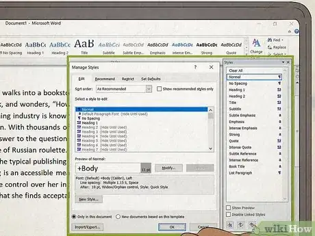
4Experiment with the preset style settings. Whether you’re using Word’s default style or one of the many available templates, you can always play around with the default style settings to create your own distinct brand. To adjust the style settings and automatically format your document however you like:[20]
- Go to the Home tab and open the Styles Pane.
- Select the style you want, then open the drop-down menu for the style and select Modify…
- Make any adjustments you want to the style in the Modify Style window. For instance, you can change the font size and color, or make adjustments to paragraph or line spacing.
- You can also right-click the style you want in the ribbon menu (or use Ctrl-click if you’re on a Mac) and select Modify Style.
- If you want a different set of preset styles to work with, go to the Design tab at the top of your document and choose one of the themes from the ribbon menu. This will change the overall look of your document.
Expert Q&A
-
QuestionHow do I make a document more visually appealing?
 Vikas AgrawalVikas Agrawal is a Visual Content Marketing Expert & Entrepreneur, as well as the Founder of Full Service Creative Agency Infobrandz. With over 10 years of experience, he specializes in designing visually engaging content, such as infographics, videos, and e-books. He’s an expert in Making content marketing strategies and has contributed to and been featured in many publications including Forbes, Entrepreneur.com, and INC.com.
Visual Content Marketing Expert & Entrepreneur Think about the purpose and goal of the text document first. For instance, you'd want to keep a proposal clean and minimalistic, while a marketing document or eBook guide would have more design elements like illustrations and visuals to make it more visually engaging.
Expert Interview
Thanks for reading our article! If you'd like to learn more about making effective presentations, check out our in-depth interview with Vikas Agrawal.
References
- ↑ https://edu.gcfglobal.org/en/business-communication/choosing-fonts-for-business-documents/1/
- ↑ https://accessibility.psu.edu/legibility/fontface/
- ↑ https://iteach.msu.edu/my-campus-ties/groups/accessible-course-design-learning-community/stories/170
- ↑ https://www.freecodecamp.org/news/how-typography-determines-readability-serif-vs-sans-serif-and-how-to-combine-fonts-629a51ad8cce/
- ↑ https://support.microsoft.com/en-us/office/align-text-left-or-right-center-text-or-justify-text-on-a-page-70da744d-0f4d-472e-916d-1c42d94dc33f
- ↑ https://ontariotraining.net/to-justify-or-not-to-justify-text/
- ↑ https://www.ferrum.edu/downloads/careers/cover-letters.pdf
- ↑ https://columbiacollege-ca.libguides.com/microsoft-word/margins
- ↑ https://apastyle.apa.org/style-grammar-guidelines/paper-format/paragraph-format
- ↑ https://support.microsoft.com/en-us/topic/set-tab-stops-and-paragraph-indents-in-microsoft-word-34361115-2b5a-9fcc-2d34-9d7c9e007b71
- ↑ https://owl.purdue.edu/owl/job_search_writing/job_search_letters/cover_letters_1_quick_tips/quick_formatting_tips.html
- ↑ https://support.microsoft.com/en-us/office/change-spacing-between-paragraphs-ee4c7016-7cb8-405e-90a1-6601e657f3ce
- ↑ https://owl.purdue.edu/owl/research_and_citation/mla_style/mla_formatting_and_style_guide/mla_general_format.html
- ↑ https://owl.purdue.edu/owl/job_search_writing/job_search_letters/cover_letters_1_quick_tips/quick_formatting_tips.html
- ↑ https://edu.gcfglobal.org/en/word2013/line-and-paragraph-spacing/1/
- ↑ https://edu.gcfglobal.org/en/word2013/line-and-paragraph-spacing/1/
- ↑ https://support.microsoft.com/en-us/office/show-or-hide-tab-marks-in-word-84a53213-5d02-404a-b022-09cae1a3958b
- ↑ https://support.microsoft.com/en-us/office/change-the-spaces-between-text-e9b96011-1c42-45c0-ad8f-e8a6e4a33462
- ↑ https://support.microsoft.com/en-us/office/smart-quotes-in-word-702fc92e-b723-4e3d-b2cc-71dedaf2f343
- ↑ https://support.microsoft.com/en-us/office/customize-or-create-new-styles-d38d6e47-f6fc-48eb-a607-1eb120dec563


