X
This article was co-authored by wikiHow staff writer, Jack Lloyd. Jack Lloyd is a Technology Writer and Editor for wikiHow. He has over two years of experience writing and editing technology-related articles. He is technology enthusiast and an English teacher.
The wikiHow Tech Team also followed the article's instructions and verified that they work.
This article has been viewed 748,617 times.
Learn more...
This wikiHow teaches you how to create a projection of a graph's data in Microsoft Excel. You can do this on both Windows and Mac computers.
Steps
Method 1
Method 1 of 2:
On Windows
-
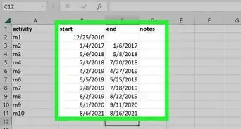
1Open your Excel workbook. Double-click the Excel workbook document in which your data is stored.
- If you don't have the data that you want to analyze in a spreadsheet yet, you'll instead open Excel and click Blank workbook to open a new workbook. You can then enter your data and create a graph from it.
-
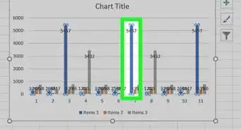
2Select your graph. Click the graph to which you want to assign a trendline.
- If you haven't yet created a graph from your data, create one before continuing.
Advertisement -
3Click +. It's a green button next to the upper-right corner of the graph. A drop-down menu will appear.
-
4Click the arrow to the right of the "Trendline" box. You may need to hover your mouse over the far-right side of the "Trendline" box to prompt this arrow to appear. Clicking it brings up a second menu.
-
5Select a trendline option. Depending on your preferences, click one of the following options
- Linear
- Exponential
- Linear Forecast
- Two Period Moving Average
- You can also click More Options... to bring up an advanced options panel after selecting data to analyze.
-
6Select data to analyze. Click a data series name (e.g., Series 1) in the pop-up window. If you named your data already, you'll click the data's name instead.
-
7Click OK. It's at the bottom of the pop-up window. Doing so adds a trendline to your graph.
- If you clicked More Options... earlier, you'll have the option of naming your trendline or changing the trendline's persuasion on the right side of the window.
-
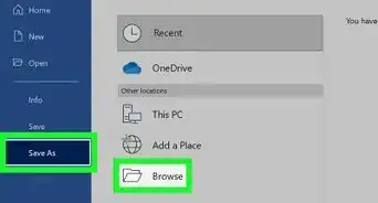
8Save your work. Press Ctrl+S to save your changes. If you've never saved this document before, you'll be prompted to select a save location and file name.
Advertisement
Method 2
Method 2 of 2:
On Mac
-
1Open your Excel workbook. Double-click the Excel workbook document in which your data is stored.
- If you don't have the data that you want to analyze in your spreadsheet, you'll instead open Excel to create a new workbook. You can then enter your data and create a graph from it.
-
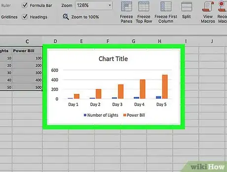
2Select the data in your graph. Click the series of data that you want to analyze to select it.
- If you haven't yet created a graph from your data, create one before continuing.
-
3Click the Chart Design tab. It's at the top of the Excel window.[1]
-
4Click Add Chart Element. This option is on the far-left side of the Chart Design toolbar. Clicking it prompts a drop-down menu.
-
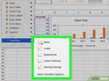
5Select Trendline. It's at the bottom of the drop-down menu. A pop-out menu will appear.
-
6Select a trendline option. Depending on your preferences, click one of the following options in the pop-out menu:[2]
- Linear
- Exponential
- Linear Forecast
- Moving Average
- You can also click More Trendline Options to bring up a window with advanced options (e.g., trendline name).
-
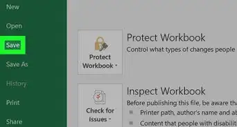
7Save your changes. Press ⌘ Command+Save, or click File and then click Save. If you've never saved this document before, you'll be prompted to select a save location and file name.
Advertisement
Community Q&A
-
QuestionHow do I choose where the data goes in Excel?
 Community AnswerJust click a section of the grid, then put whatever you need to in the box. You can also extend boxes by dragging them.
Advertisement
Warnings
- Make sure that you have sufficient data to predict a trend. It's almost impossible to analyze a "trend" in only two or three points of data.⧼thumbs_response⧽
Advertisement
References
About This Article
Advertisement


