wikiHow is a “wiki,” similar to Wikipedia, which means that many of our articles are co-written by multiple authors. To create this article, volunteer authors worked to edit and improve it over time.
The wikiHow Tech Team also followed the article's instructions and verified that they work.
This article has been viewed 33,145 times.
Learn more...
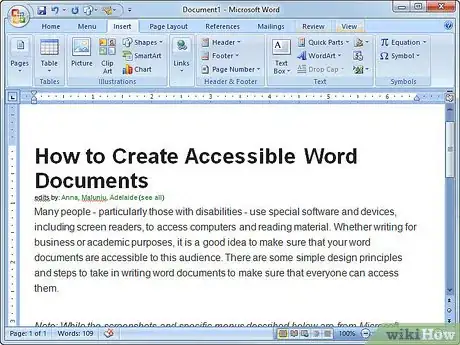
Many people - particularly those with disabilities - use special software and devices, including screen readers, to access computers and reading material. Whether writing for business or academic purposes, it is a good idea to make sure that your word documents are accessible to this audience. There are some simple design principles and steps to take in writing word documents to make sure that everyone can access them.
Note: While the screenshots and specific menus described below are from Microsoft Word, the general principles are applicable to creating accessible word documents with any word processing software.
Steps
-
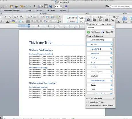
1Use Headings and Document Styles to create a navigable structure. Because screen reading software (including purchased software options for Windows computers, as well as Apple’s VoiceOver function) reads aloud anything that is visible on the screen, using Styles is helpful because it gives your document structure. Screen reading software will use audio to tell users whether a particular section of the text is a title, heading, subheading, or normal/body text. This allows users to make logical sense of the document and to skip to certain headings and topics. However, in order for the software to do this, the writer of the document needs to make those distinctions clear! Otherwise, the whole document will read as one big chunk of “Normal” body text.
- Use at least the main style options: Title, Heading (with numbered levels), and Normal.
- Make sure you identify your headings in the correct order. This helps to create an easy-to-understand system for somebody navigating your text. For example, you can assign your paper title the Title style, use the Heading 1 style for your main section headings, use Heading 2 for your subsection headings, and so on.
- Make sure that you don’t skip heading levels. Nest your headings so that their Style numbers correspond to their hierarchy (i.e. don’t go from 1 to 3 or use 3 for your main title and 1 for your subtitles; make sure 1 is the biggest heading, then 2, then 3, etc.).
- Remember that you can customize how your Styles look without affecting accessibility. Feel free to change fonts, sizes, and colors. Just make sure that each heading or piece of text is “tagged” with the right Style label so that screen readers can identify it.
- For longer documents, consider using Word’s built-in Table of Contents feature. This automatically uses your headings to create a linked Table of Contents that can make navigating your document easier for all readers.
-
2Use alt text. People with visual impairments, whether they are blind or have partial sight, may lose out if you use a lot of images, charts, shapes, photographs, or clipart in your documents. This doesn’t mean you have to skip those features – you just have to add some alternative (or “alt”) text or captions to explain what they are. Screen reading software will read Alt text or captions aloud to make sure users with visual impairments don’t miss out.
- To add alt text, start by right clicking on your image. Go to Format Picture and then Alt Text. Write a simple but complete description of the image or other visual feature in the title and/or description box (depending on its length) and click OK.
Advertisement -
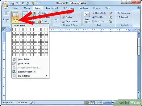
3Ensure tables are accessible. Tables are great for organizing data and information, but when they’re read by a screen reader, they can be confusing. Keeping these principles in mind can make them more accessible:
- Use clear and designated column headings. Just like you use Style headings throughout your text, use column headers to make your tables consistent and easy to navigate. Make sure that under Table Options, you select Header Row so that screen readers will identify the top row as column headings.
- Make tables as simple and logical as possible. If possible, avoid having merged or split cells only in certain columns or rows, because this will be confusing when the contents is read aloud. Stick to a standard, evenly laid out format.
- Try to make your tables read logically from left to right and top to bottom (if working in English). To get a better idea of how a screen reader will navigate your table, use the tab key on your keyboard to check the order that the cursor goes through your columns and rows.
- Using alt text for tables, as well as images and charts, can also help.
-
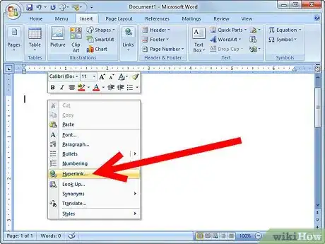
4Use meaningful hyperlink text. If you just copy and paste a long URL into your document, the screen reader will try to read out each letter – which can be a pain. A better approach involves using meaningful hyperlink text.
- When you want to add a hyperlink, right-click on the line where you want the link and select to Hyperlink (or go to Insert and then Hyperlink).
- Copy or type the URL into the address or link to text box.
- Include a simple but meaningful description under display or text to display. This is the writing that will actually be visible in your document, and when clicked it will take the reader to the website of the URL.
-
5Avoid using blank spaces or lines to create formatting or space. If you tend to hit "Tab" or "Enter" over and over again to create formatting you want, try to kick the habit. Hearing a bunch of white space (identified by a screen reader as “blank”) can be annoying and might give users with disabilities the impression that the document has ended.
- Instead, use document formatting. Rely on indentations, line spacing, and Styles to create the effect you want.
- To create extra space after lines without pressing enter, right click and go to Paragraph. Under Spacing, adjust the before, after, and line spacing options as desired to get the layout you want.
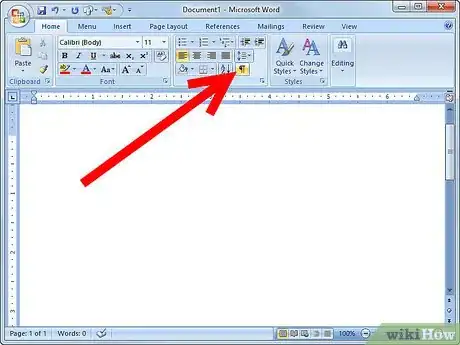
- One way to check how your document might “look” to a screen reader is to select the option to show all non-printing characters so that you can see the paragraph symbol that appears every time you hit the enter key and the dot that appears every time you hit the space bar. Ideally, these should only appear when you truly are stopping an old word or paragraph and starting a new one. They shouldn’t be there when you just want to create extra space.
-
6Avoid floating objects. When you add images, charts, or other objects, be careful with your text wrapping. If you use floating objects, screen reading software may ignore them altogether or read their Alt text in the wrong order.
- Instead, use the “top and bottom” or “in line with text” text-wrapping options.
-
7Be sure to provide alternatives for audio content. If you have audio clips or videos that may be inaccessible to people who are deaf, try to provide closed captions or transcripts to make sure they can access that content, too.
-
8Write and design with all kinds of users in mind, depending on your audience. Some users may have cognitive impairments and benefit from clear language. Some may have color blindness or other visual impairments that make low-contrast text difficult to separate from the background. Some users who rely on screen readers will have to listen to every part of your document, sometimes over and over again. If you’ve got unnecessary contents, try to weed it out. Be thorough with your contents, but if possible, stay simple in your approach.
- Keep titles short, especially if they appear often.
- If you’re using color, avoid putting very similar colors on top of one another. Contrast makes text easier to read for everybody, especially those with visual impairments.
- Don’t rely on color-coding alone. For users who can’t perceive color or are using screen readers, make sure that information is conveyed in multiple ways, not just through color of the text. For example, avoid a long list of items where red text signifies one thing and blue another.
Warnings
- Not all methods of creating PDFs result in truly accessible documents. Be sure to investigate yours because otherwise the careful work you've done in Word might be useless when you convert the document to a PDF.⧼thumbs_response⧽
