This article was written by Katherine Tlapa. Katherine Tlapa is an interior designer, currently working as a Design Specialist for Modsy, a design service based in San Francisco. She also runs her own DIY Home Design blog, My Eclectic Grace. She received her BFA in Interior Architecture from Ohio University in 2016.
There are 23 references cited in this article, which can be found at the bottom of the page.
Light blue is a fresh, serene color that instills a sense of peace and calm. It’s a versatile shade that looks gorgeous in bathrooms, bedrooms, and living rooms, and it makes a space appear larger. It’s no surprise that it’s such a popular hue for home decorating! But which colors match light blue? Luckily, there are a lot to choose from. This article suggests pleasing color combos ranging from classic to eclectic, as well as tips for featuring these stylish shades in your space. Keep reading for a collection of creative ideas for decorating with light blue.
This article is based on an interview with our interior designer, Katherine Tlapa. Check out the full interview here.
Things You Should Know
- Pair light blue with a soft shade like dusty rose, lavender, or peach to create a comforting, uplifting space.
- Be bold and add a color such as terracotta, peacock blue, or yellow-green to your palette for a rich and vibrant room.
- Design a relaxing retreat by combining light blue with a neutral white, sandy yellow, or cream.
Steps
Light Blue Color Pairings
-
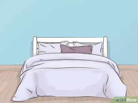
1Lavender Together, light blue and lavender have a delicate and dreamy aura that’s perfect for a feminine bedroom. With a palette this angelic, sweet dreams are sure to follow.
- Paint the walls pale blue and cover the bed with a luxurious lavender duvet.
- Up the drama by darkening the shade to a dusky plum for a bewitching, opulent pairing.
-
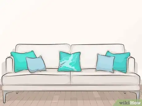
2Turquoise Place light blue next to turquoise for a refreshingly cool color scheme. These hues bring to mind a calm summer sea and fresh salt air.
- Toss some light blue and turquoise pillows on the couch to create an inviting oasis.
Advertisement -
3Peach Warm up a light blue room with the orange undertones of a peachy blush. Sweet and summery, this lighthearted palette brightens up any space.
- Upholster a chair in a peach fabric to serve as an inviting accent in a baby blue living room.
- For a cheery space, place a peachy-pink bath mat or towels in a pale blue bathroom.
-
4Terracotta This earthy, vibrant color really pops next to blue. Side-by-side, these colors evoke the striking contrast of desert mesas and cloudless skies.[1] X Research source
- This gender-neutral palette is ideal for a bedroom suite. For boho vibes, match a terracotta comforter with bed sheets and pillows in light blue. Complete the look with a natural rattan headboard.
-
5Peacock blue For an aura of quiet sophistication, use a monochromatic color palette featuring a stylish shade of peacock blue.[2] X Research source Add in hues such as midnight blue and ice blue for an elegant space with surprising depth.
- The key to an all-blue room is playing with patterns and textures.[3] X Research source Incorporate various elements such as a velvet couch, tweed chairs, embroidered throw pillows, or a patterned, woven area rug.
- Including a strong neutral like black or white can add visual interest to your scheme.[4] X Research source
-
6Dusty rose Dusty rose and light blue go hand-in-hand for a charming aesthetic.[5] X Research source Balance this palette with light cream or white to create a cottagecore design.
- If you adore darling spaces, hang wallpaper in a powder room that features this pretty palette. Choose a timeless pattern such as ticking stripes or a dainty floral print.
- A soft pastel scheme works well with vintage decor.[6] X Research source
-
7Sandy yellow This neutral shade is a natural fit for pale blue. The yellow-tan tint grounds an airy light blue, creating a pleasant coastal palette.
- Work this tone into your decor by including elements such as a maple bookshelf, a jute rug, or a varnished wood coffee table.[7] X Research source
- Change the mood by lowering the color’s intensity. A subtle blonde shade has a youthful, playful vibe when matched with light blue.[8] X Research source Paint a rocking chair pale yellow to liven up a baby blue nursery.
-
8Cherry red A dash of cherry red adds personality to a light blue space.[9] X Research source Whether you’re looking for a cool combo for a teen’s room or you're hoping to add some country charm to your kitchen, using red as an accent color is a great way to spice up a cool blue room.
- Feeling adventurous? Make your fireplace the centerpiece by painting the mantel in this vibrant shade!
- Paint a nightstand or desk cherry red for a fun splash of color.
-
9Cream This gentle color is well-balanced with light blue, so feel free to use it in large amounts.[10] X Research source Cream is versatile enough to suit almost any decor style, and you can change the mood of a room simply by swapping out the area rug.
- For a refined look, choose a blue and cream rug with an intricate oriental design. An ikat pattern captures the boho vibe, while a rug with thick stripes is ideal for a beachy theme.
- To create an inviting retreat, style your living room with a couch in this cozy shade of cream and add a light blue throw blanket.
-
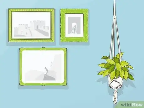
10Yellow-green If you’re looking for a popping color palette, try using yellow-green as an accent color in a light blue room.[11] X Research source Lively and playful, this is an energizing color combo.
- Include houseplants as design elements. For this vibrant color scheme, purchase a Lemon Lime Philodendron or a Neon Pothos. Plants brighten the room while bringing the outside in.[12] X Research source
- For an eclectic vibe, purchase a bunch of thrift store picture frames in a range of sizes and shapes. Spray paint them yellow-green, then create a gallery on a light blue wall.
-
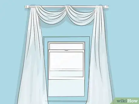
11White As a pure neutral, serene white pairs beautifully with light blue. This classic color combination is relaxing and airy and works in almost any room.[13] X Research source
- If you have light blue walls, add long, sheer curtains in crisp white for a breezy feel.
- This is a delightful palette for a sunroom. Pastel blue walls serve as an attractive backdrop for the windows and won’t compete with the view. Furnish the room with white wicker furniture to complete the look.
Decorating with Light Blue
-
1Try an ombre wall treatment. To create a gorgeous gradient, paint two parallel stripes in similar shades of blue, then quickly blend the edge of the stripes together with a brush or sponge.
- With the darkest blue near the ceiling and light blue near the floor, your space will mimic the sky!
-
2Remodel with light blue tile. For a 1950s look, install wall tile in powder blue for a nifty, retro bathroom. If your tastes are more modern, consider sleek glass tile in a pale blue.[14] X Research source
-
3Choose light blue for wood trim. Who said that baseboards, door frames, and window casings have to be white? Painting the woodwork is a cost-effective way to add interest to architectural elements in the room.[15] X Research source
-
4
-
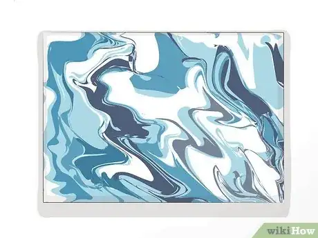
5Make artwork that includes shades of light blue. Artwork draws the eye and serves as a focal point, but finding art that perfectly suits your space can be a challenge.[17] X Research source Luckily, even beginners can easily create abstract art.
- A fun art project for beginners is pour painting. Simply prep a canvas with gesso, mix a variety of paint colors with acrylic flow medium, then layer the paints together in a single cup. Pour the paint and tilt the canvas to fully cover it in a swirling design.
-
6Paint your porch ceiling. Light blue porch ceilings have been a long-standing Southern tradition, but the trend has spread across the United States. Whether or not you subscribe to the theory that it keeps bugs (or evil spirits!) away, painting the ceiling is an enchanting way to dress up your porch.[18] X Research source
Benefits of Using Light Blue
-
1Light blue is calming. It’s been scientifically proven that colors have a physiological impact on how we feel in a space. Light blue isn’t just a soothing color to look at; research shows that blue hues can actually lower your heart rate and blood pressure.[19] X Research source
-
2Pastel blue walls make a room appear larger. Light, bright colors make a small space feel more spacious because they reflect more light.
-
3Pale blue has positive connotations. This blue tint reminds us of pure, shallow water and a cloudless sky, so it’s reassuring and familiar. People also associate the color with peace and rest.[20] X Trustworthy Source PubMed Central Journal archive from the U.S. National Institutes of Health Go to source
- In color psychology, blue symbolizes loyalty and wisdom.[21] X Research source
-
4Light blue paint can up your home’s value. Break out the brushes: research shows that home buyers are willing to offer more money when a bathroom is painted light blue. For a $290,000 USD home, they were happy to shell out nearly $5,000 more![22] X Research source
Interior Design & Color Advice
-
1Utilize the color wheel. The color wheel is a chart with hues arranged in a circle; designers use the color wheel to see relationships between colors.[23] X Research source For example, an analogous palette is created using the hues on either side of light blue: lavender-blue and a minty turquoise.[24] X Research source Analogous colors are harmonious.
- Colors that sit across from each other on the color wheel are called complementary colors. Since they’re opposites, they really grab your attention![25] X Research source Light blue’s complementary color is peach.
- A triadic color scheme is created by drawing a triangle on the color wheel. With light blue as one point, orchid and light yellow-green form the other 2 points. Since triadic colors are evenly spaced, they form a balanced palette.[26] X Research source
- Monochromatic palettes pull colors from the same wedge of the color wheel, so they’re easy on the eyes.[27] X Research source Navy, azure, and cobalt would fit in nicely with a light blue monochromatic scheme.
-
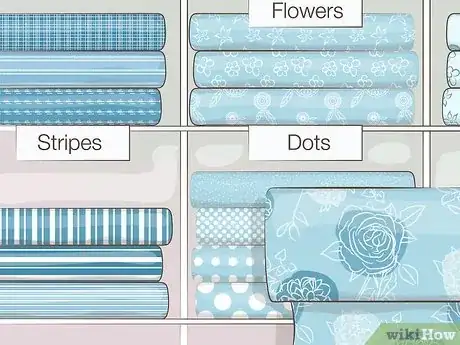
2Find a print you love. Swing by the fabric store for some design inspiration. Fabrics are typically arranged by their main color, so make a beeline for the blues. Which prints are you immediately drawn to? Notice the combination of colors, as well as how much of each shade was used. Borrow the color scheme of your favorite pattern to jumpstart your design process.[28] X Research source
-
3Apply the 60-30-10 rule. This is a design strategy where 60% of your room is your primary color, 30% is your secondary color, and a slight 10% is your accent color. If you’re creating a bold palette, rely on the 60-30-10 rule to keep your design balanced.[29] X Research source
- Your primary color is typically your wall color; it covers a lot of surface area and serves as the backdrop for your decor.[30] X Research source
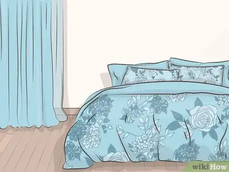
- Your secondary color shines as the main focus of the room–shop for an area rug, couch, or bedding set in this shade.[31] X Research source
- Work in a splash of your accent color with a lamp, an end table, or plant pots.[32] X Research source
You Might Also Like
 How to Fold a Gum Wrapper Heart in 9 Simple Steps







References
- ↑ https://foter.com/colors-that-go-with-terracotta
- ↑ https://artincontext.org/peacock-blue/#Monochromatic_Peacock_Colors
- ↑ https://www.allaboutinteriors.org/home-living-ideas/create-monochromatic-color-scheme/
- ↑ https://www.smashingmagazine.com/2010/02/color-theory-for-designer-part-3-creating-your-own-color-palettes/
- ↑ https://foter.com/guide-to-cottagecore-decor-let-this-aesthetic-bloom-indoors
- ↑ https://www.smashingmagazine.com/2010/02/color-theory-for-designers-part-2-understanding-concepts-and-terminology/
- ↑ https://www.housedigest.com/768782/25-ideas-to-decorate-a-blue-themed-bedroom/
- ↑ https://www.smashingmagazine.com/2010/02/color-theory-for-designers-part-2-understanding-concepts-and-terminology/
- ↑ https://www.forbes.com/home-improvement/interior/what-colors-go-with-red/
- ↑ https://artincontext.org/baby-blue-color/#What_Colors_Go_With_Baby_Blue-2
- ↑ https://artincontext.org/baby-blue-color/#What_Colors_Go_With_Baby_Blue-2
- ↑ https://www.housedigest.com/768782/25-ideas-to-decorate-a-blue-themed-bedroom/
- ↑ https://www.housedigest.com/768782/25-ideas-to-decorate-a-blue-themed-bedroom/
- ↑ https://youtube.com/shorts/Hbw2cEESW-o?feature=share
- ↑ https://youtu.be/Bx69Aulw9Pc?t=161
- ↑ https://www.housedigest.com/768782/25-ideas-to-decorate-a-blue-themed-bedroom/
- ↑ https://www.housedigest.com/768782/25-ideas-to-decorate-a-blue-themed-bedroom/
- ↑ https://www.npr.org/templates/story/story.php?storyId=5645263
- ↑ https://scholar.ui.ac.id/en/publications/effect-of-blue-red-and-green-colors-on-blood-pressure-and-heart-r
- ↑ https://pubmed.ncbi.nlm.nih.gov/21667759/
- ↑ https://www.sensationalcolor.com/meaning-of-blue/
- ↑ https://www.zillowgroup.com/news/paint-colors-that-could-lead-to-higher-offers/
- ↑ https://www.interaction-design.org/literature/topics/color-theory
- ↑ https://artincontext.org/analogous-colors/
- ↑ https://uxplanet.org/analogous-colors-and-color-wheel-609a05b5b90e
- ↑ https://pavilion.dinfos.edu/Article/Article/2305097/color-theory-basics/
- ↑ https://xd.adobe.com/ideas/process/ui-design/what-is-color-theory/
- ↑ https://foter.com/the-60-30-10-color-rule-applying-it-breaking-it
- ↑ https://foter.com/the-60-30-10-color-rule-applying-it-breaking-it
- ↑ https://foter.com/the-60-30-10-color-rule-applying-it-breaking-it
- ↑ https://foter.com/the-60-30-10-color-rule-applying-it-breaking-it
- ↑ https://foter.com/the-60-30-10-color-rule-applying-it-breaking-it
- ↑ https://color.adobe.com/create/color-wheel
About This Article

