A line graph is a type of chart which displays information as a series of data points connected by straight line segments. It is a basic type of chart common in many fields. It is similar to a scatter plot except that the measurement points are ordered (typically by their x-axis value) and joined with straight line segments. A line chart is often used to visualize a trend in data over intervals of time – a time series – thus the line is often drawn chronologically.
Plotting
A line chart is typically drawn bordered by two perpendicular lines, called axes. The horizontal axis is called the x-axis and the vertical axis is called the y-axis. To aid visual measurement, there may be additional lines drawn parallel either axis. If lines are drawn parallel to both axes, the resulting lattice is called a grid.
Each axis represents one of the data quantities to be plotted. Typically the y-axis represents the dependent variable and the x-axis (sometimes called the abscissa) represents the independent variable. The chart can then be referred to as a graph of quantity one versus quantity two, plotting quantity one up the y-axis and quantity two along the x-axis.
Example
In the experimental sciences, such as statistics, data collected from experiments are often visualized by a graph. For example, if one were to collect data on the speed of a body at certain points in time, one could visualize the data to look like the graph in :
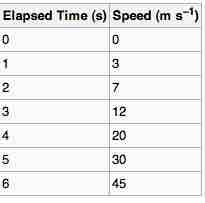
Data Table
A data table showing elapsed time and measured speed.
The table "visualization" is a great way of displaying exact values, but can be a poor way to understand the underlying patterns that those values represent. Understanding the process described by the data in the table is aided by producing a graph or line chart of Speed versus Time:
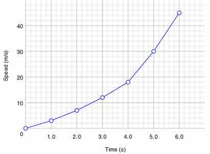
Line chart
A graph of speed versus time
Best-Fit
In statistics, charts often include an overlaid mathematical function depicting the best-fit trend of the scattered data. This layer is referred to as a best-fit layer and the graph containing this layer is often referred to as a line graph.
It is simple to construct a "best-fit" layer consisting of a set of line segments connecting adjacent data points; however, such a "best-fit" is usually not an ideal representation of the trend of the underlying scatter data for the following reasons:
1. It is highly improbable that the discontinuities in the slope of the best-fit would correspond exactly with the positions of the measurement values.
2. It is highly unlikely that the experimental error in the data is negligible, yet the curve falls exactly through each of the data points.
In either case, the best-fit layer can reveal trends in the data. Further, measurements such as the gradient or the area under the curve can be made visually, leading to more conclusions or results from the data.
A true best-fit layer should depict a continuous mathematical function whose parameters are determined by using a suitable error-minimization scheme, which appropriately weights the error in the data values. Such curve fitting functionality is often found in graphing software or spreadsheets. Best-fit curves may vary from simple linear equations to more complex quadratic, polynomial, exponential, and periodic curves. The so-called "bell curve", or normal distribution often used in statistics, is a Gaussian function.