This article was co-authored by wikiHow staff writer, Jennifer Mueller, JD. Jennifer Mueller is a wikiHow Content Creator. She specializes in reviewing, fact-checking, and evaluating wikiHow's content to ensure thoroughness and accuracy. Jennifer holds a JD from Indiana University Maurer School of Law in 2006.
wikiHow marks an article as reader-approved once it receives enough positive feedback. In this case, several readers have written to tell us that this article was helpful to them, earning it our reader-approved status.
This article has been viewed 365,187 times.
Learn more...
A statistical report informs readers about about a particular subject or project. You can write a successful statistical report by formatting your report properly and including all the necessary information your readers need.[1]
Steps
Formatting Your Report
-
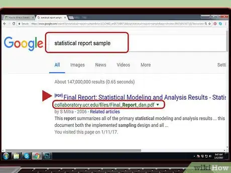
1Look at other statistical reports. If you've never written a statistical report before, you might benefit from looking at other statistical reports that you can use as a guide to format your own.[2] You also get a good idea of how your finished report should look.[3]
- If you're completing your report for a class, your instructor or professor may be willing to show you some reports submitted by previous students if you ask.
- University libraries also have copies of statistical reports created by students and faculty researchers on file. Ask the research librarian to help you locate one in your field of study.
- You also may be able to find statistical reports online that were created for business or marketing research, as well as those filed for government agencies.
- Be careful following samples exactly, particularly if they were completed for research in another field. Different fields of study have their own conventions regarding how a statistical report should look and what it should contain. For example, a statistical report by a mathematician may look incredibly different than one created by a market researcher for a retail business.
-
2Type your report in an easy-to-read font. Statistical reports typically are typed single-spaced, using a font such as Arial or Times New Roman in 12-point size. If you have an assignment sheet that describes the formatting requirements, follow those exactly.[4]
- You typically want to have 1-inch margins around all sides of your report. Be careful when adding visual elements such as charts and graphs to your report, and make sure they don't bleed over the margins or your report may not print properly and will look sloppy.
- You may want to have a 1.5-inch margin on the left-hand side of the page if you anticipate putting your study into a folder or binder, so all the words can be read comfortably when the pages are turned.
- Don't double-space your report unless you're writing it for a class assignment and the instructor or professor specifically tells you to do so.
- Use headers to add the page number to every page. You may also want to add your last name or the title of the study along with the page number.
Advertisement -
3Use the appropriate citation method. Different fields use different citation methods to reference articles, books, and other materials you used in your research. Even if you're more comfortable with another citation method, use the one most common in the field of your research.[5]
- Citation methods typically are included in style manuals, which not only detail how you should cite your references but also have rules on acceptable punctuation and abbreviations, headings, and the general formatting of your report.
- For example, if you're writing a statistical report based on a psychological study, you typically must use the style manual published by the American Psychological Association (APA).
- Your citation method is all the more important if you anticipate your statistical report will be published in a particular trade or professional journal.
-
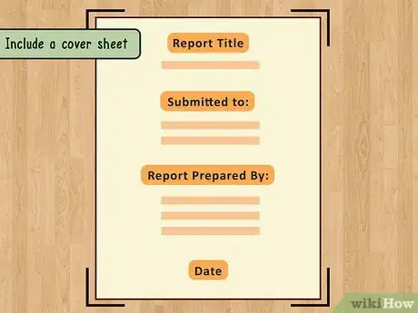
4Include a cover sheet. A cover sheet provides the title of your statistical report, your name, and the names of any other people who substantially contributed to your research or to the report itself. It provides a neat presentation for your final report.
- If you're creating your statistical report for a class, a cover sheet may be required. Check with your instructor or professor or look on your assignment sheet to find out whether a cover sheet is required and what should be included on it.
- For longer statistical reports, you may also want to include a table of contents. You won't be able to format this until after you've finished the report, but it will list each section of your report and the page on which that section starts.
-
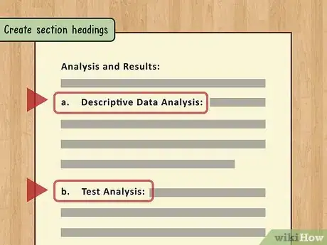
5Create section headings. Depending on how your report will be used and who will read it, headings can make your report easier to read. This is particularly true if you believe your readers will be more likely to skim the report or jump around between sections.
- If you decide to create section headings, they should be bold-faced and set off in such a way that they stand out from the rest of the text. For example, you may want to center bold-faced headings and use a slightly larger font size.
- Make sure a section heading doesn't fall at the bottom of the page. You should have at least a few lines of text, if not a full paragraph, below each section heading before the page break.
-
6Use "print preview" to check the layout. When you draft your report in a word processing program, it typically will look the same on a sheet of paper as it does on your screen. But visual elements in particular may not line up the way you want them.
- Check the margins around visual elements and make sure the text lines up and is not too close to the visual element. You want it to be clear where the text ends and the words associated with the visual element (such as the axis labels for a graph) begin.
- Visual elements can cause your text to shift, so you'll need to double-check your section headings after your report is complete and make sure none of them are at the bottom of a page.
- Where possible, you also want to change your page breaks to eliminate situations in which the last line of a page is the first line of a paragraph, or the first line of a page is the last line of a paragraph. These are difficult to read.
Creating Your Content
-
1Write the abstract of your report. The abstract is a brief description, typically no longer than 200 words or so, that summarizes all elements of your project, including the research methods used, the results, and your analysis.
- Avoid overly scientific or statistical language in your abstract as much as possible. Your abstract should be understandable to a larger audience than those who will be reading the entire report.
- It can help to think of your abstract as an elevator pitch. If you were in an elevator with someone and they asked you what your project was about, your abstract is what you would say to that person to describe your project.
- Even though your abstract appears first in your report, it's often easier to write it last, after you've completed the entire report.
-
2Draft your introduction. The introduction of your report identifies the purpose of your research or experiment. Explain to the reader why you undertook this particular project, including the questions you hoped to answer.
- Aim for clear and concise language to set the tone for your report. Put your project in layperson's terms rather than using overly statistical language, regardless of the target audience of your report.
- If your report is based on a series of scientific experiments or data drawn from polls or demographic data, state your hypothesis or expectations going into the project.
- If other work has been done in the field regarding the same subject or similar questions, it's also appropriate to include a brief review of that work after your introduction. Explain why your work is different or what you hope to add to the existing body of work through your research.
-
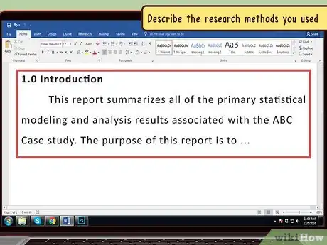
3Describe the research methods you used. Use this section of your report to provide a detailed account of how you went about your project, including the nature of any experiments conducted or the methods you used to collect raw data.
- Include a description of any particular methods you used to track results, particularly if your experiments or studies were longer-term or observational in nature.
- If you had to make any adjustments during the development of the project, identify those adjustments and explain what required you to make them.
- List any software, resources, or other materials you used in the course of your research. If you used any textbook material, a reference is sufficient – there's no need to summarize that material in your report.
-
4Present your results. Report the specific findings of your research or experiment. This section of your report should be facts only, without any analysis or discussion of what those facts might mean.
- Start with your main results, then include subsidiary results or interesting facts or trends you discovered.
- Generally you want to stay away from reporting results that have nothing to do with your original expectations or hypotheses. However, if you discovered something startling and unexpected through your research, you may want to at least mention it.
- This typically will be the longest section of your report, with the most detailed statistics. It also will be the driest and most difficult section for your readers to get through, especially if they are not statisticians.
- Small graphs or charts often show your results more clearly than you can write them in text.
-
5State your conclusions. This section provides analysis and defines your results within the overall context of your field or industry. You also should indicate to the reader whether your findings matched your initial hypotheses.
- When you get to this section of your report, leave the heavy, statistical language behind. This section should be easy for anyone to understand, even if they skipped over your results section.
- If any additional research or study is necessary to further explore your hypotheses or answer questions that arose in the context of your project, describe that as well.
-
6Discuss any problems or issues. If your findings relate to or contradict any previous studies, talk about this at the end of your report. This is also where you'll address any problems you might have had conducting your study.
- It is often the case that you see things in hindsight that would have made data-gathering easier or more efficient. This is the place to discuss those. Since the scientific method is designed so that others can repeat your study, you want to pass on to future researchers your insights.
- Any speculation you have, or additional questions that came to mind over the course of your study, also are appropriate here. Just make sure you keep it to a minimum – you don't want your personal opinions and speculation to overtake the project itself.
-
7List your references. Immediately following your statistical report, you should include a table or list of any books or articles you used in completing your research, or that you referred to in the report itself.
- For example, if you compared your study to a similar study conducted in another city the year before yours, you would want to include a citation to that report in your references.
- Cite your references using the appropriate citation method for your discipline or field of study.
- Avoid citing any references that you did not mention in your report. For example, you may have done some background reading in preparation for your project. However, if you didn't end up directly citing any of those sources in your report, there's no need to list them in your references.
-
8Keep your audience in mind. Your report will have very little value if nobody who reads it understands what you did or what you achieved. Even if you're writing your statistical report as an assignment for a class, you likely should write it for a more general audience.
- Avoid trade "terms of art" or industry jargon if your report will be read mainly by people outside your particular industry.
- Make sure the terms of art and statistical terms that you do use in your report are used correctly. For example, you shouldn't use the word "average" in a statistical report because people often use that word to refer to different measures. Instead, use "mean," "median," or "mode" – whichever is correct.
Presenting Your Data
-
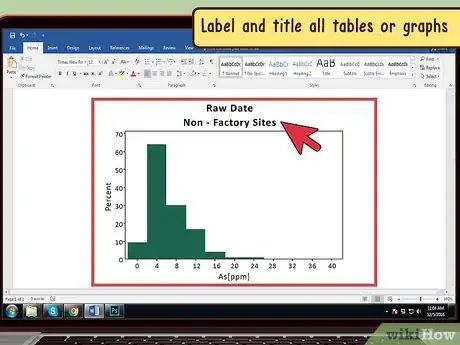
1Label and title all tables or graphs. Providing a distinct label and title for each visual element allows you to refer to it in your text. Using spatial references in your text can cause problems since your report may not print the same way.
- This is particularly important if you're submitting your report for publication in a trade journal. If the pages are different sizes than the paper you print your report on, your visual elements won't line up the same way in the journal as they do in your manuscript.
- This also can be a factor if your report will be published online, since different display sizes can cause visual elements to display differently.
- The easiest way to label your visual elements is "Figure," followed by a number. Then you simply number each element sequentially in the order in which they appear in your report.
- Your title describes the information presented by the visual element. For example, if you've created a bar graph that shows the test scores of students on the chemistry class final, you might title it "Chemistry Final Test Scores, Fall 2016."
-
2Keep your visual elements neat and clean. If your visual elements look sloppy and cluttered on the page, they will be difficult for your readers. Visual elements should enhance the readability of your report, not detract from it.
- Make sure each visual element is large enough in size that your readers can see everything they need to see without squinting. If you have to shrink down a graph to the point that readers can't make out the labels, it won't be very helpful to them.
- Create your visual elements using a format that you can easily import into your word-processing file. Importing using some graphics formats can distort the image or result in extremely low resolution.
-
3Distribute information appropriately. When creating a chart or graph, it should be readable and easily understandable at a glance. If it's too cluttered with data, or the range is too broad, your readers won't get much out of it.[6]
- For example, if you have hundreds of samples, your x axis will be cluttered if you display each sample individually as a bar. However, you can move the measure on the y axis to the x axis, and use the y axis to measure the frequency.
- When your data include percentages, only go out to fractions of a percentage if your research demands it. If the smallest difference between your subjects is two percentage points, there's no need to display more than the whole percentage. However, if the difference between your subjects comes down to hundredths of a percent, you would need to display percentages to two decimal places so the graph would show the difference.
- For example, if your report includes a bar graph of the distribution of test scores for a chemistry class, and those scores are 97.56, 97.52, 97.46, and 97.61, your x axis would be each of the students and your y axis would start at 97 and go up to 98. This would highlight the differences in the students' scores.
-
4Include raw data in appendices. Particularly for extensive projects, your appendices may be the lengthiest part of your report. You should include all raw data, including copies of interview questions, data sets, and statistical results.
- Be careful that your appendix does not overwhelm your report. You don't necessarily want to include every data sheet or other document you created over the course of your project.
- Rather, you only want to include documents that reasonably expand and lead to a further understanding of your report.
- For example, when describing your methods you state that a survey was conducted of students in a chemistry class to determine how they studied for the final exam. You might include a copy of the questions the students were asked in an appendix. However, you wouldn't necessarily need to include a copy of each student's answers to those questions.
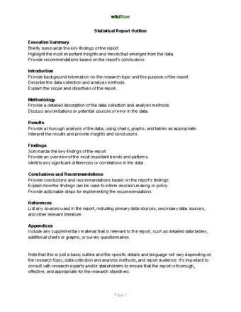
Statistical Report Outline
Community Q&A
-
QuestionWhat is the simplest way to explain a hypothesis in a research paper?
 Community AnswerWrite out what you think the article is trying to get at. Sum it up as just that.
References
- ↑ https://www.ibm.com/docs/en/iotdm/11.3?topic=SSMLQ4_11.3.0/com.ibm.nex.optimd.dg.doc/11arcperf/oparcuse-r-statistical_reports.html
- ↑ https://www.examples.com/business/report/statistics-report.html
- ↑ https://collaboratory.ucr.edu/sites/g/files/rcwecm2761/files/2019-04/Final_Report_dan.pdf
- ↑ https://tex.stackexchange.com/questions/49386/what-is-the-recommended-font-to-use-for-a-statistical-table-in-an-academic-journ
- ↑ https://psychology.ucsd.edu/undergraduate-program/undergraduate-resources/academic-writing-resources/writing-research-papers/citing-references.html
- ↑ https://www.youtube.com/watch?v=kl3JOCmuil4
About This Article
Start your statistical report with an introduction explaining the purpose of your research. Then, dive into your research methods, how you collected data, and the experiments you conducted. Present you results with any necessary charts and graphs, but do not discuss or analyze the numbers -- in a statistical report, all analysis should happen in the conclusion. Once you’ve finished writing your report, draft a 200 word abstract and create a cover sheet with your name, the date, and the report title. Don’t forget to cite the appropriate references when necessary! For more formatting help, read on!
