

Excel XP
Creating a Chart
Understanding the Different Chart Types
Excel XP allows you to create many different kinds of charts.
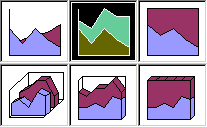
Area Chart
An area chart emphasizes the trend of each value over time. An area chart also shows the relationship of parts to a whole.
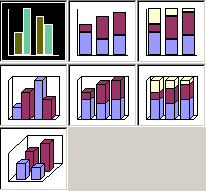
Column Chart
A column chart uses vertical bars or columns to display values over different categories. They are excellent at showing variations in value over time.
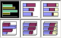
Bar Chart
A bar chart is similar to a column chart except these use horizontal instead of vertical bars. Like the column chart, the bar chart shows variations in value over time.
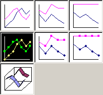
Line Chart
A line chart shows trends and variations in data over time. A line chart displays a series of points that are connected over time.
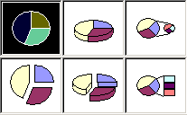
Pie Chart
A pie chart displays the contribution of each value to the total. Pie charts are a very effective way to display information when you want to represent different parts of the whole, or the percentages of a total.
Other Charts
Other charts that can be created in Excel XP include: Doughnut; Stock XY (scatter); Bubble; Radar; Surface; or Cone, Cylinder, and Pyramid charts.


