

Excel 2003
Formatting a Chart
Formatting the axis labels
We've previously made reference to a Y axis and an X axis in Excel. In Excel, a graph represents a data in two dimensions. The number of items sold in January is data on two dimensions: number of items and month. The number of items might be plotted on the Y axis, while the month may be plotted on the X axis. The Y axis runs up and down on the graph, while the X axis runs left to right.
When formatting the axis labels in your chart, you can adjust the numbers on the scale of the chart, as well as change font, color, and style.
To format an axis:
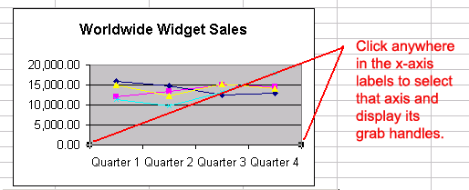
- Click anywhere in the axis label you want to edit:

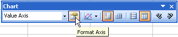
- Click the Format button on the Chart toolbar (or double-click the chart axis).
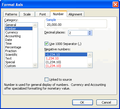
- The Format Axis dialog box contains five different tabs—Patterns, Scale, Font, Number, and Alignment—that can be used to format the axis.
- The Patterns tab lets you define borders and tick marks.
- The Scale tab lets you define numeric intervals on the value (Y) axis scale.
- The Font tab lets you define font, font style, size, and color.
- The Number tab lets you define the format of numbers displayed in the axis (see lesson 12).
- The Alignment tabs let you define text orientation (see lesson 11).
- Click the OK button to accept the axis format changes.
 You can also use the angle axis buttons on the chart toolbar to change the angle of the value and category axis.


