This article was co-authored by Kathi Burns, CPO®. Kathi Burns is a board certified Professional Organizer (CPO) and Founder of Organized and Energized!, her consulting business with a mission to empower people to master their environment and personal image by assisting them in taking control, making change and organizing their lives. Kathi has over 17 years of organizing experience and her work has been featured on Better Homes and Gardens, NBC News, Good Morning America, and Entrepreneur. She has a BS in Communication from Ohio University.
There are 13 references cited in this article, which can be found at the bottom of the page.
wikiHow marks an article as reader-approved once it receives enough positive feedback. In this case, several readers have written to tell us that this article was helpful to them, earning it our reader-approved status.
This article has been viewed 982,313 times.
Color coordinating can be a little daunting if you've never been introduced to color theory based on the color wheel. The color wheel is a great tool to help you choose colors that go together whether you're putting together an outfit, choosing paint colors for your house, or decorating for a special occasion.
Steps
Understanding the Color Wheel
-
1Figure out the basics of the color wheel. The color wheel is made up of primary colors (red, blue, yellow) and secondary colors (purple, green, orange) in the shape of a wheel. Primary colors can't be formed by mixing other colors whereas secondary colors are created by mixing primary colors. In turn, primary and secondary colors mix together to form tertiary colors.[1]
- Some color wheels depict 3 primary colors, 3 secondary colors, and 6 tertiary colors in separate spokes while other color wheels blend colors one into another as a continuum.
- It's important to understand the color wheel because it guides how you choose coordinating colors.
-
2Look across the wheel to find complementary colors. Complementary colors are directly opposite each other on the color wheel. For instance, yellow is directly across from the secondary color purple, red is across from green, and blue is across the wheel from orange. Complementary colors typically go well together, brightening the other one just by being nearby.[2]
- Complementary colors can also include tertiary colors.
Advertisement -
3Check for analogous colors right next to each other. Analogous colors are often paired together because they fade into each other on the color wheel. For instance, yellow fades into orange, making a yellow-orange tertiary color in the middle. Because they are near each other, they blend well when trying to coordinate colors.[3]
- As another example, blue blends into purple, making blue-purple in the middle.
-
4Use shading and tinting to make monochromatic matches. "Shade" just means you add black to a color to make it darker. "Tint" means adding white to a color to make it lighter. If you choose a single color, then you can pick lighter or darker variations of that color to create a monochromatic look.[4]
- For instance, monochromatic colors in purple could include lavender, plum, and grape.
-
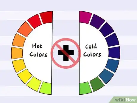
5Avoid mixing warm and cool colors for the most part. Warm colors include orange, red, and yellow, while cool colors include greens, blues, and purple. When you understand this division, it can make it easier to coordinate colors, as you can match cool colors with cool colors and warm colors with warm ones.
- While this is a good general guideline, there are times when a warm color looks nice paired with a cool color, like a rich, warm gold accented with cool purple tones.
Applying the Color Wheel to Clothes
-
1Build an outfit out of a neutral color and a bright color for simple coordination. Neutral colors include black, white, brown, gray, and even olive and navy at times, but they can also include metallics like silver, bronze, and gold. Pick a neutral for the main part of your outfit, then add 1-2 other colors around it.[5]
- For instance, try a black suit with a pale pink shirt or a silver dress with a bright blue jacket thrown over it.
- When pairing neutrals like navy and olive with other colors, think about their hues. For instance, olive complements maroons and oranges, but it also does well with blues and golds because they're nearby on the color wheel.
-
2Try an outfit made of complementary colors for something bright and fun. Pick out 2 complementary colors on the color wheel, and use that to build your outfit. If you choose orange and blue, for instance, you might pair a bright orange shirt with a dark pair of blue jeans.[6]
- Another good way to use complementary colors to good effect is to pair 1 complementary color with a paler tint of its opposite color. For example, mix a purple dress with a pale yellow shawl.
-
3Use analogous colors for a pulled-together look. Try picking 2-3 colors that are right next to each other on the wheel and guide your outfit with those. These similar hues will make your outfit seem cohesive. For example, you might pair a bright yellow sundress with a pale orange scarf.[7]
- Another example of using analogous colors to good effect might be a scarlet red dress with gold jewelry and pink shoes.
- While you usually should avoid mixing warm and cool colors, you can occasionally break that rule if you find something that looks good together. For instance, with your bright yellow dress, you might find a pale green cardigan that looks smashing with it.[8]
-
4Choose monochromatic colors for an easy coordinated look. A good place to start with a monochrome look is with the primary colors. Pick a single color to start your look, then choose shades and tints of that color to put together your outfit. For instance, try a navy pantsuit with a pale blue shirt and bright blue pumps.[9]
- When you're creating a monochrome look, try to stay in the same spoke on the color wheel. That is, if you choose blue, make sure you're picking true blues, not purple-y blues.
-
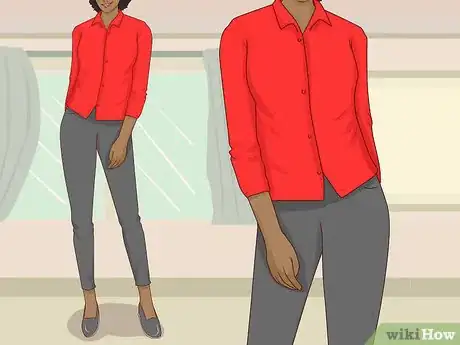
5Color block primary colors with neutrals. The primary colors red, yellow and, blue often look great with a solid block of color, such as black pants with a yellow top. Try wearing a bright red shirt with grey leggings or royal blue skirt with a flowing white top, for instance.[10]
- If you want to go bolder, try pairing more than 1 primary color in an outfit, such as blue jeans, a bright red top, and a yellow purse.
-
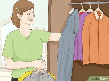
6Mix and match to see what goes well together. Usually, you can tell when 2 colors don't look quite right together by holding them up next to one another. However, you may not be able to guess before you see them together. Pull all the items out of your closet and try mixing and matching different pieces you don't normally put together. You may come up with something that looks awesome together that you never would have worn before.EXPERT TIPKathi Burns is a board certified Professional Organizer (CPO) and Founder of Organized and Energized!, her consulting business with a mission to empower people to master their environment and personal image by assisting them in taking control, making change and organizing their lives. Kathi has over 17 years of organizing experience and her work has been featured on Better Homes and Gardens, NBC News, Good Morning America, and Entrepreneur. She has a BS in Communication from Ohio University.Fashion Stylist

 Kathi Burns, CPO®
Fashion StylistMatch your wardrobe to your skin, hair, and eye colors. Your skin tone, hair color, and eye color affect what colors will look best on you. For example, if you have darker features, you might look best in deep reds, greens, and browns. On the other hand, if you're very fair, you might look better in blacks and whites and bright colors.
Coordinating Paint Colors
-
1Try starting out with a neutral in your central room. If you begin with a subtle color in the central room, then you can paint bold colors in the nearby rooms without them clashing. Otherwise, you might find your rooms seem to be working against each other rather than creating a cohesive look.[11]
- Try a soft grey, a cream, or pale tan, for instance.
- An alternative option is to pick a bold color you like, and put that in the room you want it in. Then move out from there, picking colors that coordinate throughout your house.
-
2Opt for bold colors off of your main room. Since you went with a neutral color in your main room, you can get a bit crazier as you move outward. However, keep the line of sight in mind. For instance, if you can see from your dining room into your living room (the neutral room) and then into the hallway, you should probably pick coordinating colors for the dining room and hallway.[12]
- For example, if you choose a periwinkle for your dining room, you might pick a light peach for the hallway, since those are complementary colors.
-
3Follow the rules of using analogous, complementary, or monochromatic colors. Pick the type of coordination that you like the best and apply it to your color scheme. For instance, if you love blues, then you might try a monochromatic scheme featuring different hues of blue. If you like bright, bold colors, try using complementary colors. For a rainbow effect, opt for analogous colors through your house.[13]
- For instance, for an analogous scheme, you might paint one room pale yellow, the next one pale peach, and the next one pale pink.
-
4Pay attention to the line of sight and to rooms next to each other. When picking colors, make sure that you apply these schemes in rooms that you can see through to the next one. Similarly, even if you can't see much of 1 bedroom from the one next to it, you still want to apply a color wheel scheme to help the house feel more cohesive.[14]
- This is especially true if you have an open concept house.
- With separate floors, you can use different schemes if you'd like, as the stairway creates a separation.
Warnings
- Avoid using two colors that are nearly the same but not quite, as that will usually create an unpleasant visual effect.⧼thumbs_response⧽
References
- ↑ https://www.bhg.com/decorating/color/basics/color-wheel-color-chart/
- ↑ http://www.worqx.com/color/complements.htm
- ↑ https://www.bhg.com/decorating/color/basics/color-wheel-color-chart/
- ↑ https://www.bhg.com/decorating/color/basics/color-wheel-color-chart/
- ↑ https://www.cosmopolitan.com/style-beauty/fashion/a5759/simple-ways-to-master-color-mixing/
- ↑ https://www.collegefashion.net/fashion-tips/a-foolproof-guide-to-matching-colors-in-your-outfits/
- ↑ https://www.collegefashion.net/fashion-tips/a-foolproof-guide-to-matching-colors-in-your-outfits/
- ↑ https://www.cosmopolitan.com/style-beauty/fashion/a5759/simple-ways-to-master-color-mixing/
- ↑ https://www.collegefashion.net/fashion-tips/a-foolproof-guide-to-matching-colors-in-your-outfits/
- ↑ https://www.cosmopolitan.com/style-beauty/fashion/a5759/simple-ways-to-master-color-mixing/
- ↑ https://www.forbes.com/sites/houzz/2013/07/29/how-to-pick-a-color-palette-for-your-whole-house/#4bbb110c3716
- ↑ https://www.forbes.com/sites/houzz/2013/07/29/how-to-pick-a-color-palette-for-your-whole-house/#4bbb110c3716
- ↑ https://www.bhg.com/decorating/color/basics/color-wheel-color-chart/
- ↑ https://www.forbes.com/sites/houzz/2013/07/29/how-to-pick-a-color-palette-for-your-whole-house/#4bbb110c3716
About This Article
To coordinate your clothing colors, try to mix colors that are next to each other on the color wheel, like bright yellow and pale orange, since wearing multiple complimentary colors can come off too strong. You can also use red, yellow, and blue to compliment single-color outfits, like wearing a blue scarf with an all-black outfit. In general, though, try to pair 1 colored item with 1 neutral one so the colors don’t seem overwhelming. Don't be afraid to experiment with different color combinations to see what goes well together. You may discover colors that look awesome together that you never would have worn before! For tips on understanding the color wheel, read on!


