Statistics
Textbooks
Boundless Statistics
Correlation and Regression
Correlation
Statistics Textbooks Boundless Statistics Correlation and Regression Correlation
Statistics Textbooks Boundless Statistics Correlation and Regression
Statistics Textbooks Boundless Statistics
Statistics Textbooks
Statistics
Concept Version 7
Created by Boundless

Scatter Diagram

A scatter diagram is a type of mathematical diagram using Cartesian coordinates to display values for two variables in a set of data.

Learning Objective

  • Demonstrate the role that scatter diagrams play in revealing correlation.


Key Points

    • The controlled parameter, or independent variable, is customarily plotted along the horizontal axis, while the measured or dependent variable is customarily plotted along the vertical axis.
    • If no dependent variable exists, either type of variable can be plotted on either axis, and a scatter plot will illustrate only the degree of correlation between two variables.
    • A scatter plot shows the direction and strength of a relationship between the variables.
    • You can determine the strength of the relationship by looking at the scatter plot and seeing how close the points are to a line.
    • When you look at a scatterplot, you want to notice the overall pattern and any deviations from the pattern.

Terms

  • Cartesian coordinate

    The coordinates of a point measured from an origin along a horizontal axis from left to right (the $x$-axis) and along a vertical axis from bottom to top (the $y$-axis).

  • trend line

    A line on a graph, drawn through points that vary widely, that shows the general trend of a real-world function (often generated using linear regression).


Example

    • To display values for "lung capacity" (first variable) and how long that person could hold his breath, a researcher would choose a group of people to study, then measure each one's lung capacity (first variable) and how long that person could hold his breath (second variable). The researcher would then plot the data in a scatter plot, assigning "lung capacity" to the horizontal axis, and "time holding breath" to the vertical axis. A person with a lung capacity of 400 ml who held his breath for 21.7 seconds would be represented by a single dot on the scatter plot at the point (400, 21.7) in the Cartesian coordinates. The scatter plot of all the people in the study would enable the researcher to obtain a visual comparison of the two variables in the data set, and will help to determine what kind of relationship there might be between the two variables.

Full Text

A scatter plot, or diagram, is a type of mathematical diagram using Cartesian coordinates to display values for two variables in a set of data. The data is displayed as a collection of points, each having the value of one variable determining the position on the horizontal axis, and the value of the other variable determining the position on the vertical axis.

In the case of an experiment, a scatter plot is used when a variable exists that is below the control of the experimenter. The controlled parameter (or independent variable) is customarily plotted along the horizontal axis, while the measured (or dependent variable) is customarily plotted along the vertical axis. If no dependent variable exists, either type of variable can be plotted on either axis, and a scatter plot will illustrate only the degree of correlation (not causation) between two variables. This is the context in which we view scatter diagrams.

Relevance to Correlation

A scatter plot shows the direction and strength of a relationship between the variables. A clear direction happens given one of the following:

  • High values of one variable occurring with high values of the other variable or low values of one variable occurring with low values of the other variable.
  • High values of one variable occurring with low values of the other variable.

You can determine the strength of the relationship by looking at the scatter plot and seeing how close the points are to a line, a power function, an exponential function, or to some other type of function. When you look at a scatterplot, you want to notice the overall pattern and any deviations from the pattern. The following scatterplot examples illustrate these concepts .

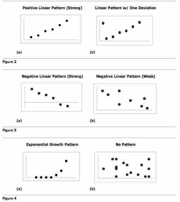
Scatter Plot Patterns

An illustration of the various patterns that scatter plots can visualize.

Trend Lines

To study the correlation between the variables, one can draw a line of best fit (known as a "trend line"). An equation for the correlation between the variables can be determined by established best-fit procedures. For a linear correlation, the best-fit procedure is known as linear regression and is guaranteed to generate a correct solution in a finite time. No universal best-fit procedure is guaranteed to generate a correct solution for arbitrary relationships.

Other Uses of Scatter Plots

A scatter plot is also useful to show how two comparable data sets agree with each other. In this case, an identity line (i.e., a $y=x$ line or $1:1$ line) is often drawn as a reference. The more the two data sets agree, the more the scatters tend to concentrate in the vicinity of the identity line. If the two data sets are numerically identical, the scatters fall on the identity line exactly.

One of the most powerful aspects of a scatter plot, however, is its ability to show nonlinear relationships between variables. Furthermore, if the data is represented by a mixed model of simple relationships, these relationships will be visually evident as superimposed patterns.

[ edit ]
Edit this content
Prev Concept
An Intuitive Approach to Relationships
Coefficient of Correlation
Next Concept
Subjects
  • Accounting
  • Algebra
  • Art History
  • Biology
  • Business
  • Calculus
  • Chemistry
  • Communications
  • Economics
  • Finance
  • Management
  • Marketing
  • Microbiology
  • Physics
  • Physiology
  • Political Science
  • Psychology
  • Sociology
  • Statistics
  • U.S. History
  • World History
  • Writing

Except where noted, content and user contributions on this site are licensed under CC BY-SA 4.0 with attribution required.