

Word 2013
Charts
Introduction
Video: Charts
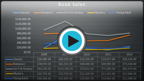 Watch the video (5:12).
A chart is a tool you can use to communicate data graphically. Including a chart in your document can allow your reader to see the meaning behind the numbers, and it can make showing comparisons and trends easier.
Optional: Download our Lesson 24 Practice Document.
Types of charts
Word has many different types of charts, allowing you to choose the one that best fits your data. In order to use charts effectively, you'll need to understand how different charts are used.
Click the arrows in the slideshow below to learn more about the types of charts in Word.
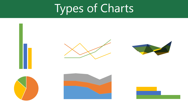
Word has a variety of chart types, each with its own advantages. Click the arrows to see some of the different types of charts available in Word.
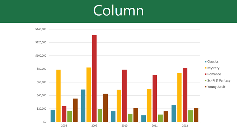
Column charts use vertical bars to represent data. They can work with many different types of data, but they're most frequently used for comparing information.
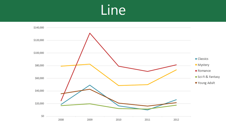
Line charts are ideal for showing trends. The data points are connected with lines, making it easy to see whether values are increasing or decreasing over time.
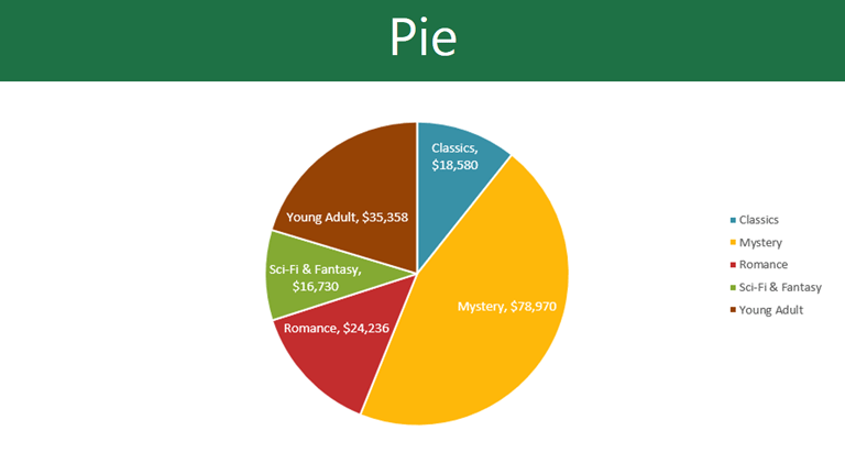
Pie charts make it easy to compare proportions. Each value is shown as a slice of the pie, so it's easy to see which values make up the percentage of a whole.
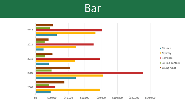
Bar charts work just like column charts, but they use horizontal bars instead of vertical bars.
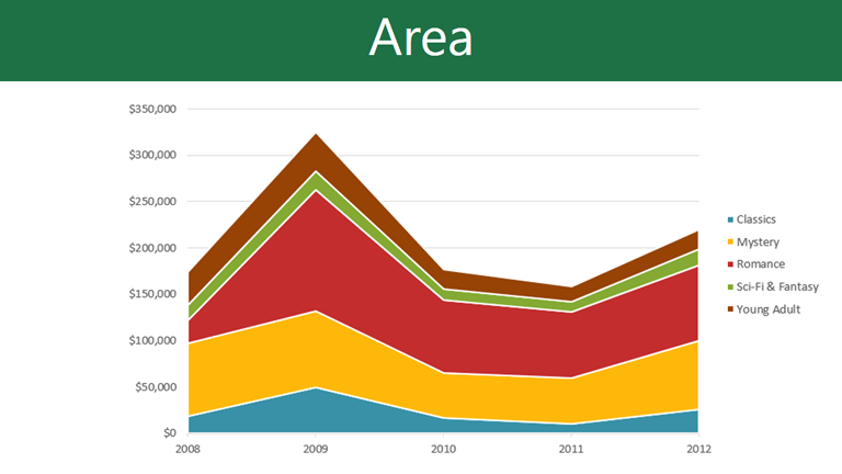
Area charts are similar to line charts, except that the areas under the lines are filled in.
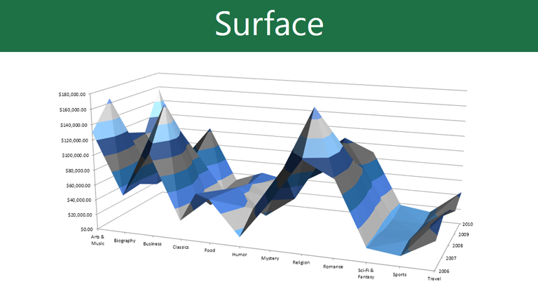
Surface charts allow you to display data across a 3D landscape. They work best with large data sets, allowing you to see a variety of information at the same time.

Identifying the parts of a chart
Click the buttons in the interactive below to learn about the different parts of a chart.
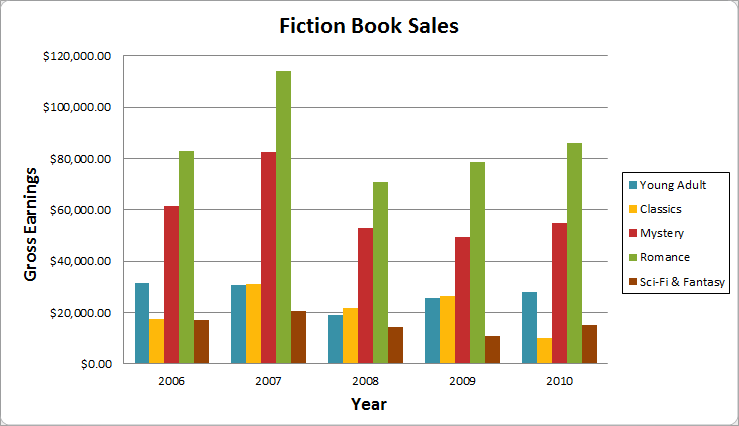
Horizontal Axis
The horizontal axis (also known as the x axis) is the horizontal part of the chart.
In this example, the horizontal axis identifies the categories in the chart, so it is also called the category axis. However, in a bar chart, the vertical axis would be the category axis.
Legend
The legend identifies which data series each color on the chart represents. For many charts it is crucial, but for some charts it may not be necessary and can be deleted.
In this example, the legend allows the viewer to identify the different book genres in the chart.
Data Series
The data series consists of the related data points in a chart. If there are multiple data series in the chart, each one will have a different color or style. Pie charts can only have one data series.
In this example, the green columns represent the Romance data series.
Title
The title should clearly describe what the chart is illustrating.
Vertical Axis
The vertical axis (also known as the y axis) is the vertical part of the chart.
In this example (a column chart), the vertical axis measures the height, or value of the columns, so it is also called the value axis. However, in a bar chart, the horizontal axis would be the value axis.


