

PowerPoint XP
Adding Charts, Diagrams, and Tables
Labeling a Chart
You may also want to label your chart with such information as the title and what the X and Y axes represent. In the default chart, the X axis is the horizontal information while the Y axis is the vertical information.
To Label a Chart:
- Click on Chart
 Chart Options.
 - A dialog box appears.
- Click on the Titles tab (if it is not already selected).
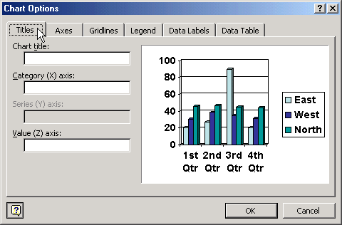
- In the box below Chart Title, type in the title.
- In the box below Category (X) axis, type in the label for this information. It appears in the rows on the left of the datasheet and in a box on the right of the chart.
- In the box below Value (Y) axis, type in the label for this information.
- Click OK.
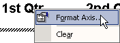
To Change Text Alignment of Label:
- Right click on the text and choose Format Axis title.
- Click on the Alignment tab.
- Choose your text alignment and orientation options.
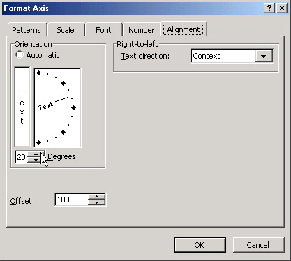
- Click OK.


